Repository navigation
Fix: floating operation pill stays theme-aware in Light mode (#213) - #215
Conversation


|
I did some quick tests and looked through it and it seems to work. Does this interfere with anything you might be working on? If not, ill merge it. I always use dark mode so I didnt even realise this was an issue haha |
|
Thanks for the quick reply. I haven't worked on any other issues or FRs in here so far. This PR actually only involves those two files. |

|
@StudioNirin hold off on the merge for a moment, it does interfere, though not in the way the question was meant. @DeLo1585 the theme change itself looks good and the approach is the right one, I'll come back to that. The problem is the branch. It's based on current main, but the two files were committed as their v3.2.0 versions with the token change applied on top, so the diff carries everything that's landed in those files since the release as deletions. That's 276 lines removed against 86 added. Merging it as is would take out all of the Recently Added styles, the share-mismatch warning, the extras badge and bytes-first progress line from #210, and the group id keying that stops two groups for the same show from colliding in the banner. Easy to miss when you've been testing by copying the files into a running container, since that container is on 3.2.0 too. The fix is small. Check out main, reapply only the token block and the On the design side, some background. The pill being dark in light mode was a deliberate call back in February, not a leftover. Light theme came later than the rest of the UI, we tried a light pill at the time and it didn't look right, so we kept it dark with a stronger border and shadow. I'm not against a light pill, but the pill's status colours are hard coded literals that were tuned for a black surface, and they don't hold up on white. In your screenshots the Plex orange idle accent clashes with the card, and the muted text is going to be hard to read, since a lot of the swaps land at 0.15 to 0.25 black on white. The light blue countdown timer is a fixed colour too. If you want to keep going with the light surface, I'd suggest:
If that ends up being a lot of tuning, the other option the issue itself raised is fine with me: keep the pill as a deliberate dark element in light mode and give it a stronger border so it reads as intentional. Either way, thanks for digging into this, light mode has had less attention than it deserves. |
|
Ahh I see, good catch @Brandon-Haney I didnt think to look for that |
|
Yeah, I used the v3.2.0 source zip, that explains it, wasn't on current main. I redo the changes against the current branch (with Claude's Sonnet help) and then update this PR and let you both know once it's ready first adjustments results were:
|
|
(Worked with Claude Sonnet 5 on this patch — hoping nothing got scrambled or out of sync this time around!) I've rebased against current main and reapplied just the token block + rgba swaps on top, nothing else touched. Diff is now 45 removed / 120 added in custom.css and a clean 13/13 in the template, all one-line replacements, no removed blocks (Recently Added, the share-mismatch warning, extras badge, bytes-first progress, and the group-id keying are all untouched and still present). On the design points, I went with tuning it rather than falling back to a dark pill, using your suggestions directly:
Pushed both files to the same branch. Let me know if the contrast tiers need further adjustment, I picked the boosted values based on your 0.45–0.6 guidance but didn't have a way to measure actual contrast ratios here. |
|
Small correction to my last comment, the I originally tried deriving it dynamically as Functionally the result is the same either way, tint stays in sync with whichever state/token is active, this is just the version that's actually in the branch now. Sorry for the mismatch in the writeup. so @StudioNirin @Brandon-Haney its ready for review the updates 2 files |
|
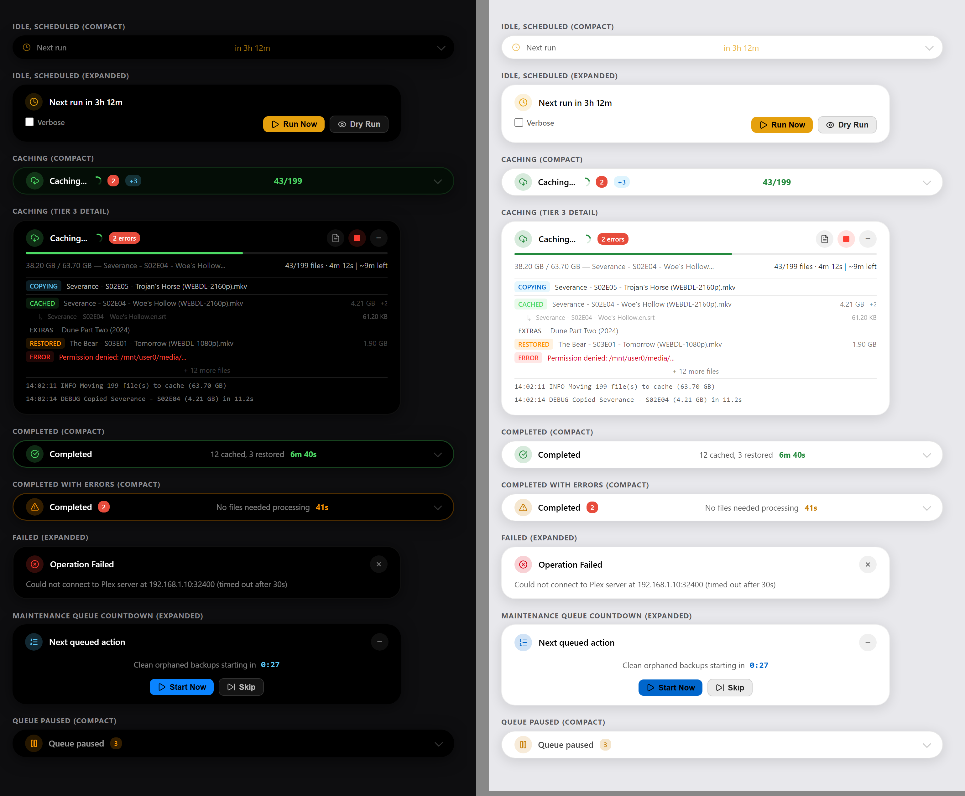
Went through the rebased branch and it's clean now. Merge base is current main, every removed line is one of the literal colour swaps, the template is 13 one-line replacements, and all the code I was worried about is untouched. Dark theme resolves to the same values as before. Nice work turning that around quickly. I put the pill states side by side in both themes (dark left, light right) and measured the light side. All the text tiers you boosted come out above 4.5:1, most well above, so the tiering approach did its job. Click the image for full size, or open dark and light separately.
Two spots are still short:
Happy to approve once those two are in. @StudioNirin from my side this is good to merge after that. |

|
@Brandon-Haney Thank you for your Honest expertise and the comparison screenshots. This overview is truly fantastic, and helps me a lot. I will implement this change within the next 12 hours 🙏👌💪 |
Looks good, buzz me when youve made that change and ill merge. 🫡 |
|
Both fixed.
While Sonnet5 was at it and went looking for anything else with the same shape of bug and found one more: "Resume" in the Queue Paused state had the identical setup
Testing on my own container in a bit, but happy for you to take another pass whenever, in case something else is still off that I haven't caught. Don't have your nice side-by-side comparison setup though, so I'm mostly eyeballing it :D |
…t-theme tweaks
|
Went through 1. The state colour disappears. On black, the accent-tinted border was how you told caching from restoring from a failure without reading the label. In light mode the running pills keep that border at an 18% tint, which is close to invisible on white, and the finished and failed pills still use their dark-theme literals at 30%, so every state comes out as a plain white pill. Keying the border off each state's
2. Separation over cards. The pill floats over whatever is at the top of the page, which in light mode is usually a white card. Its shadow is the same weight the cards use, so it reads as part of the card underneath. The theme already has
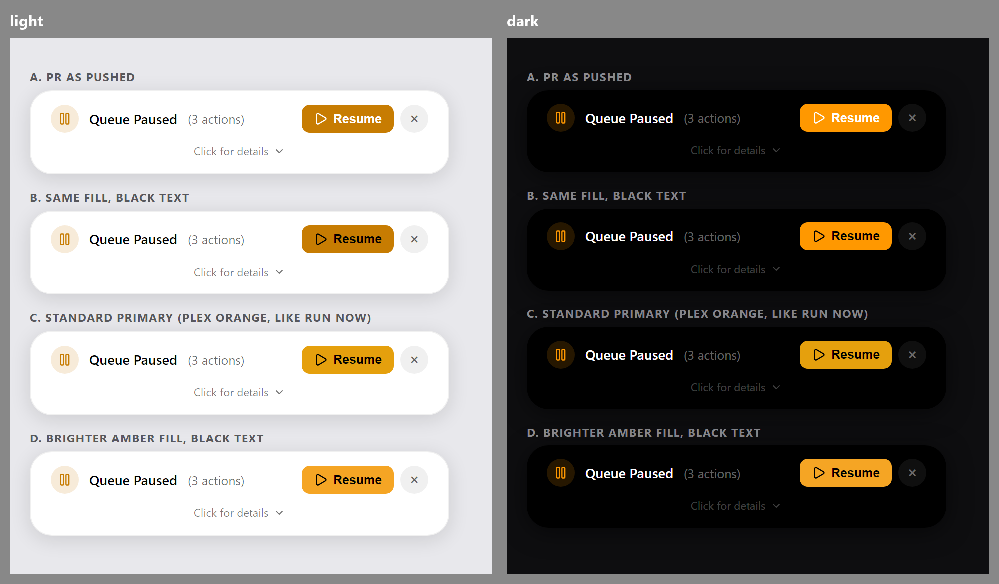
3. Resume. The white text fixed one thing and exposed another. White on the light warning orange measures about 3.3:1, and the bigger issue is the fill: that token was darkened so it works as text on white, and darkening a saturated orange pushes it toward brown, which clashes next to the Plex orange on Run Now. I'd drop the inline background and colour on Resume entirely and let it be a normal
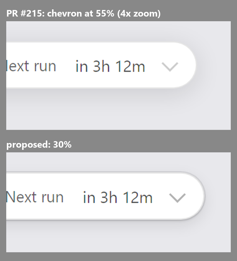
4. Chevron (optional). The expand chevron shares a text tier so it went from 20% to 55%. It's decorative and doesn't need a text ratio, and at 55% it's heavier than in dark. 30% keeps it quiet. Take it or leave it.
One note on the text tiers so it doesn't look like I'm ignoring it: the sidecar rows, sizes and "+ N more" all land at the same weight now, where dark has three visible levels. Anything lighter at those sizes fails 4.5:1, so I think you made the right trade. If it bothers anyone later, depth can come back through weight rather than alpha. How to implementAll of this is light-theme only. Nothing in the dark theme changes, and none of it touches the
a) In the existing block at line 1254: [data-theme="light"] .di-pill {
border: 1px solid var(--plex-border);
box-shadow: 0 4px 20px rgba(0,0,0,0.12);
}replace the box-shadow: var(--plex-shadow-elevated), 0 1px 2px rgba(0,0,0,0.10);
b) Append this after the /* State colour on the pill border. Running pills carry .di-glow; finished
and failed pills set their own border in the dark rules above, so list
them here too. Keys off each state's --accent, which is already remapped
to the semantic tokens for light mode. */
[data-theme="light"] .di-glow,
[data-theme="light"] .di-pill--completed,
[data-theme="light"] .di-pill--completed-errors,
[data-theme="light"] .di-pill--error,
[data-theme="light"] .di-pill--disconnected,
[data-theme="light"] .di-pill--dry-run {
border-color: color-mix(in srgb, var(--accent) 55%, transparent);
}
/* The expand chevron is decorative, not text, so it does not need a text
tier. Keep it as quiet as it is in dark. */
[data-theme="light"] .di-pill__compact::after {
border-right-color: rgba(0,0,0,0.3);
border-bottom-color: rgba(0,0,0,0.3);
}Two things to know so the result matches the renders:
At line 1369, the Resume button in the queue-paused state: <button class="di-btn di-btn--primary" style="background: var(--plex-warning); color: var(--di-btn-text-on-accent); height: 28px;"becomes: <button class="di-btn di-btn--primary" style="height: 28px;"
Happy to push all of this to your branch if that's easier than another round trip, just say so. |
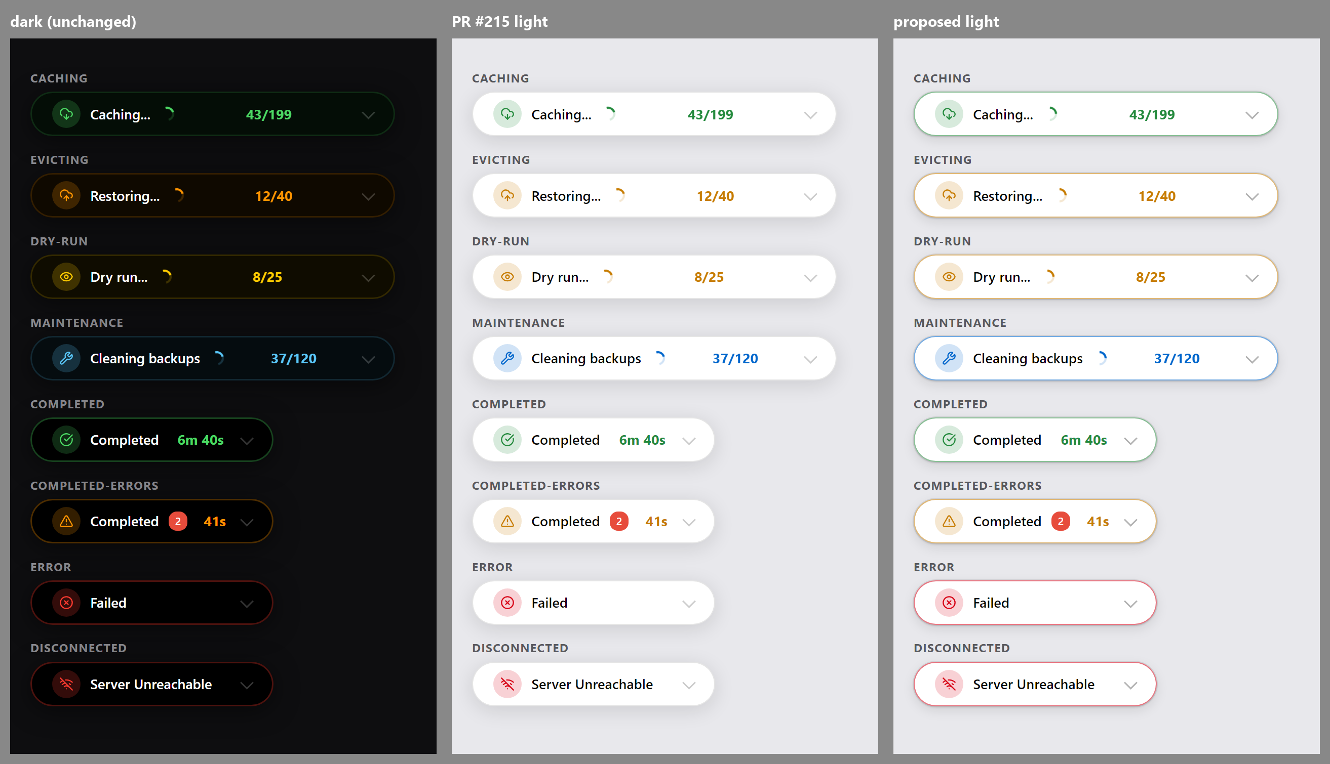
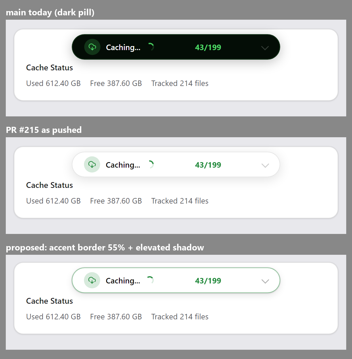
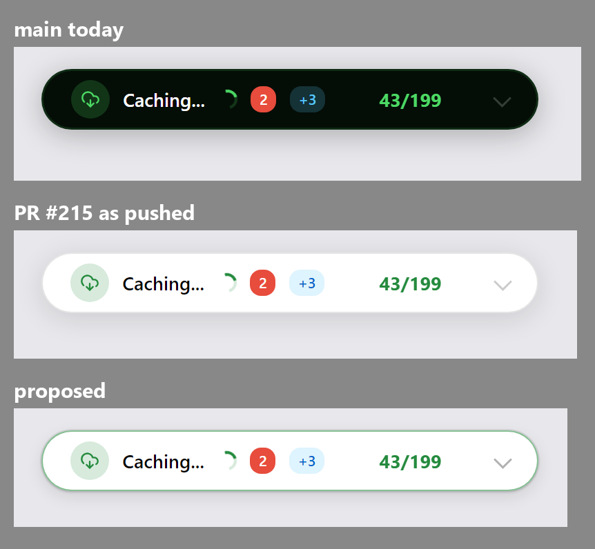
|
Im keeping an eye on this, but I'm going to leave the details down to you two as i literally never use light mode on any app haha. I get migraines so i have to avoid any apps without a dark mode 😄 Ill keep following the progress though, and once youre happy with it ill merge and then probably push a new version. |
|
Thanks @Brandon-Haney — I’m happy to take all of these changes. 1. State colour: Absolutely yes. I really like the coloured border in your proposed version — actually, I love it. It brings back the visual distinction between the different states without making the pills feel too heavy. I’d definitely like to keep that. 2. Shadow / separation: Also yes. I’m happy to use 3. Resume: I agree with your proposal here too. The amber fill with black text looks the best to me, and I’d be very happy to make that change. I’m also fine with the small dark-theme change that comes with using the regular 4. Chevron: There seems to be a small technical discrepancy in the reasoning here. The resting chevron is currently using
so 20% white, and it isn’t tied to a text tier
So from a technical/code perspective, I wouldn’t describe this as correcting a 55% value. That said, looking at your render, I actually really like your proposed version visually. It looks very clean and gives the chevron just a little more presence without making it too strong. So even though I wouldn’t base the change on the technical reasoning above, I’m absolutely happy with the 30% version if it looks like your render in the actual UI. So yes — please go ahead and push all four changes to my branch. Thanks again for taking the time to go through the states and put together the comparison renders. I really like where this is heading. |

Give each pill state its accent-coloured border in light mode, using
the semantic tokens the states already map to, so caching, restoring,
maintenance, dry runs and failures read at a glance the way they do on
the dark pill. Use the theme's elevated shadow so the pill sits above
the page card it floats over, and make Resume a standard primary button
to match Run Now in both themes. The resting expand chevron gets a
little more presence on white.
|
Pushed On the chevron, I had the numbers wrong in my write-up. The resting one is a raw 20% of the foreground rather than a tier, so in light it was 20% black and this takes it to 30%, a small step up rather than down from 55%. The CSS comment says that now. Hover at Also trimmed the comment on @StudioNirin from my side this is ready to merge once DeLo1585 has had a look on their container. |

 DeLo1585
left a comment
DeLo1585
left a comment
DeLo1585
left a comment
There was a problem hiding this comment.
Thanks @Brandon-Haney, and thanks for correcting the chevron note.
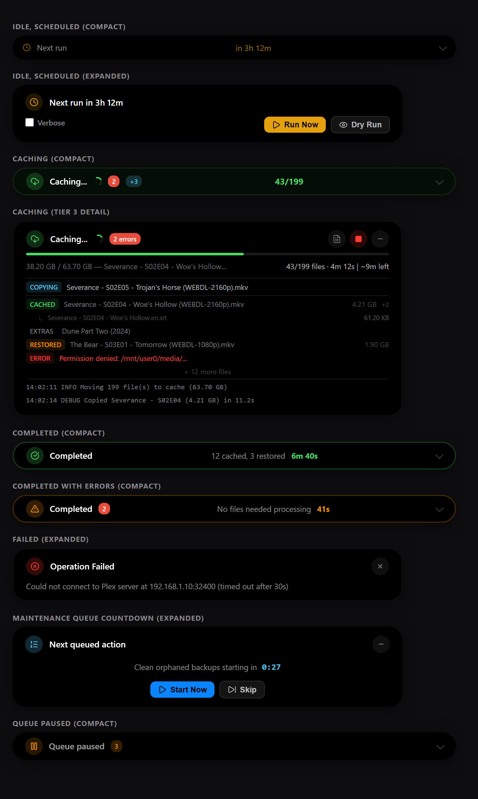
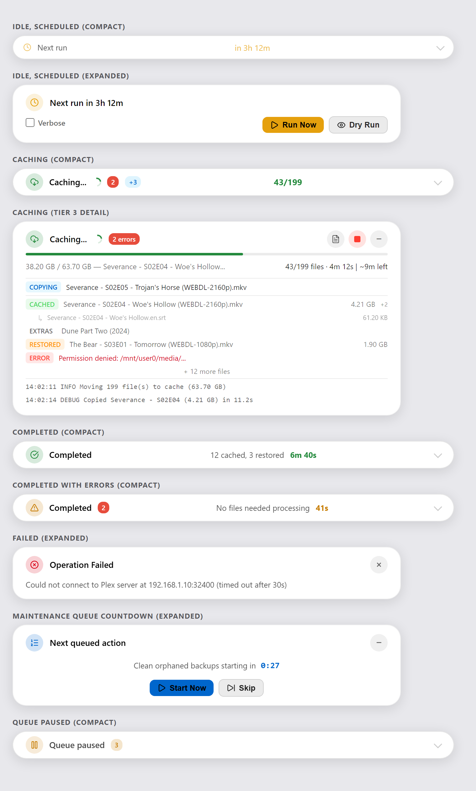
I pulled these two files from bef8802 into my container and went through the states in both themes. It looks great in light, the coloured borders make the states readable again, and the elevated shadow separates the pill from the cards nicely. Resume now matches Run Now, and dark looks the same as before apart from that button.
From my side this is good to merge. @StudioNirin whenever you have time for the code owner review.

3 participants


Fixes #213
Source review / writing / testing done together with Claude Sonnet 5 (Anthropic).
What changed
The floating operation-status pill (
#global-operation-banner .di-pill) previously had a hard-coded black background and white text/decoration colors throughout, both in its compact and expanded (Tier 2/3, detail-log) states. The existing Light theme override only softened the drop shadow, intentionally keeping the pill black (see the removed comment "Pill stays dark in light mode").This PR makes the pill genuinely theme-aware for Light mode instead, while leaving Dark mode pixel-identical to before.
Approach
Introduced three CSS custom properties, scoped to
#global-operation-banner(the pill's outer, always-present container):Dark theme keeps these at their original literal values, so nothing changes there.
[data-theme="light"] #global-operation-banneroverrides them to a light surface (var(--plex-bg-card)) and dark-on-light text, matching the rest of the app's existing Light theme palette:All previously hard-coded
rgba(255,255,255,X)/#fff/#1a1a1aoccurrences inside the pill (label, muted metric, progress bar/track, divider, expand-hint, detail log rows, queue/countdown text, etc. — both compact and expanded states) now reference these tokens instead, in bothcustom.cssand the few inlinestyle="..."occurrences inglobal_operation_banner.htmlthat CSS classes alone couldn't reach.Left untouched on purpose:
--accentoperation-state colors (.di-pill--caching,--evicting,--error, etc.) — caching/evicting/error color coding is identical in both themes..di-error-badgekeeps fixed white text, since its background is always red regardless of theme.Testing
Manually tested on a running v3.2.0 container (Docker/Unraid) by swapping in the patched files via
docker cpand comparing both themes before/after:Screenshots: