Conversation


Fix: embed operation pill in page header so it no longer overlaps UI (StudioNirin#216)

The banner was absolutely positioned and independent of the header flex
row, so it covered buttons at higher zoom and the mobile header/sidebar
on phones. It is now a flex item of .page-header (moved by a small script
in base.html), wraps below the title/buttons row at <=1400px and keeps
the expanded pill as an overlay with a lower z-index.
Fix: embed operation pill in page header so it no longer overlaps UI (StudioNirin#216)

The banner was absolutely positioned and independent of the header flex
row, so it covered buttons at higher zoom and the mobile header/sidebar
on phones. It is now a flex item of .page-header (moved by a small script
in base.html), wraps below the title/buttons row at <=1400px and keeps
the expanded pill as an overlay with a lower z-index.

|
it would be a pleasure to put your eyes on this. I'm running exactly these two files (custom.css + base.html) in my container on top of the #215 state and they behave as shown in the screenshots. Things I'd especially like a second opinion on:
Happy to change anything you'd prefer done differently. Thanks! |

|
Thanks for this, the root cause analysis is spot on. Dropping the z-index below the mobile header and sidebar is the right fix for the phone issue, so I'd keep that as is. For context on the design: the pill is meant to work like a Dynamic Island. It sits at the top of the page, centred, stays compact, and expands in place when you hover or click it. So ideally it keeps that position whenever there's room, and only moves when it would actually collide with something. That's why I'd suggest a different approach to the 1400px breakpoint. It kicks in much earlier than needed. At 1280px on the Dashboard there's around 300px free between the title and the buttons, but the pill still drops to its own row. And since it's measured against one page, it can't account for other titles, button counts or a collapsed sidebar. What I have in mind:
With that, the That said, I'm open to other approaches if you find something that works better on your setup. Once it's updated I'll pull the branch and try it myself, and we can go with whatever works best for everyone. |
Fix: fit check moves operation pill below header only on collision (StudioNirin#216)

The pill stays centred like before. A small fit check in base.html compares
it with the page title, action buttons and theme toggle and adds .di-flow on
a collision, which turns the banner into a full-width row of the page header
after the buttons. Re-checked on header resize, banner content changes and
font load. Banner z-index lowered to 100 so it stays below the mobile header
and sidebar.
Fix: fit check moves operation pill below header only on collision (StudioNirin#216)

The pill stays centred like before. A small fit check in base.html compares
it with the page title, action buttons and theme toggle and adds .di-flow on
a collision, which turns the banner into a full-width row of the page header
after the buttons. Re-checked on header resize, banner content changes and
font load. Banner z-index lowered to 100 so it stays below the mobile header
and sidebar.
Fix: fit check moves operation pill below header only on collision (StudioNirin#216)

The pill stays centred like before. A small fit check in base.html compares
it with the page title, action buttons and theme toggle and adds .di-flow on
a collision, which turns the banner into a full-width row of the page header
after the buttons. Re-checked on header resize, banner content changes and
font load. Banner z-index lowered to 100 so it stays below the mobile header
and sidebar.
Fix: fit check moves operation pill below header only on collision (StudioNirin#216)

The pill stays centred like before. A small fit check in base.html compares
it with the page title, action buttons and theme toggle and adds .di-flow on
a collision, which turns the banner into a full-width row of the page header
after the buttons. Re-checked on header resize, banner content changes and
font load. Banner z-index lowered to 100 so it stays below the mobile header
and sidebar.
|
Thanks a lot @Brandon-Haney , that makes sense. I reworked it along your lines and pushed the update to the branch. What changed:
Two small things I added on purpose:
Results from my tests (headless Chromium, all page headers, sidebar open and collapsed, 390 to 2336px, plus a phone): no overlap and no horizontal scrolling in 112 checks, and the pill moves back up when the window is widened again without a reload. Note that on the Dashboard the centred pill still collides with the buttons earlier than the free gap suggests, because it is centred on the page and not in the gap: it switches at about 1380px with the sidebar open and about 1240px collapsed. The other pages keep the pill on top much longer (Settings, Logs, Cached Files and Storage stay up at 1280px). While a job is running the pill is wider (about 360px), so on the Dashboard it drops below the buttons at any width. Regarding the |

|
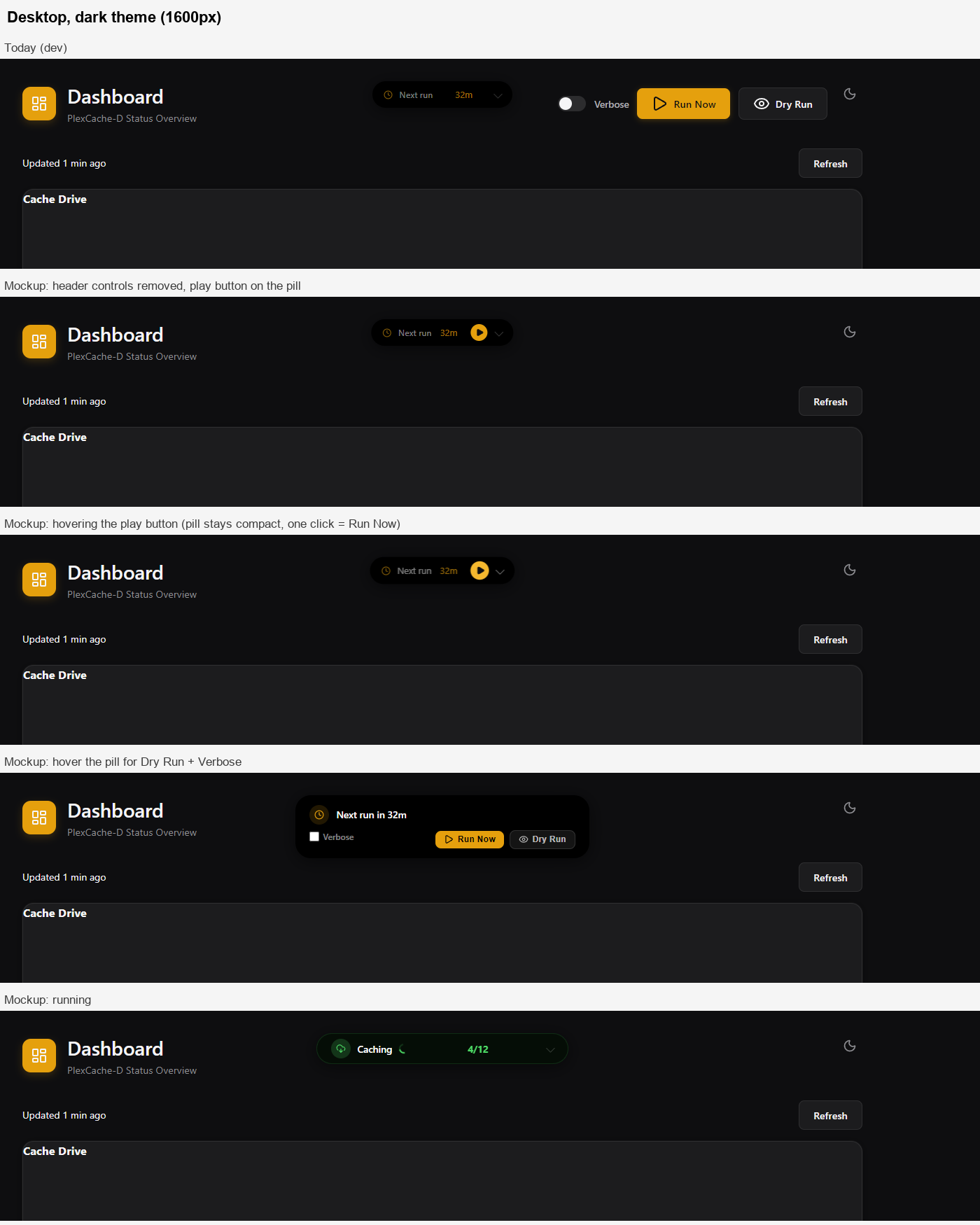
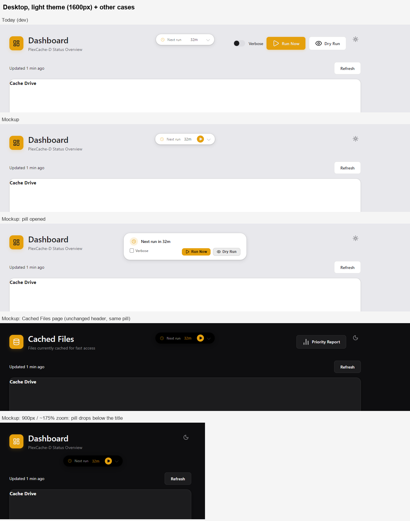
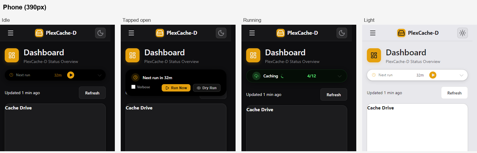
Thanks for the update, I pulled it and it does what we discussed. I couldn't get the pill to overlap anything at any width, idle or running. One small thing: the MutationObserver has Your note about the Dashboard colliding early got me looking at that header, and I'd like both your opinions on a follow-up before I build it. The Verbose / Run Now / Dry Run controls there duplicate what the pill already has, and the header copy has a few issues of its own: the buttons only get disabled when the page loads, so they go stale during or after a run; Dry Run looks clickable when it's disabled; and the header Verbose toggle saves to a different setting than the pill's checkbox, so the two Run Now buttons can run with different verbosity. What I have in mind: remove those three controls from the Dashboard header, and give the idle pill a small play button so Run Now is still one click ( Mockups, built on top of this branch:
The trade-off is that Run Now becomes an icon rather than a labelled button, and Dry Run needs one more click. @StudioNirin would you be OK with that change? If so I'd do it as a separate PR after this one merges, so it doesn't hold this up. @DeLo1585 curious what you think too, since you've been living with the header at high zoom. |

|
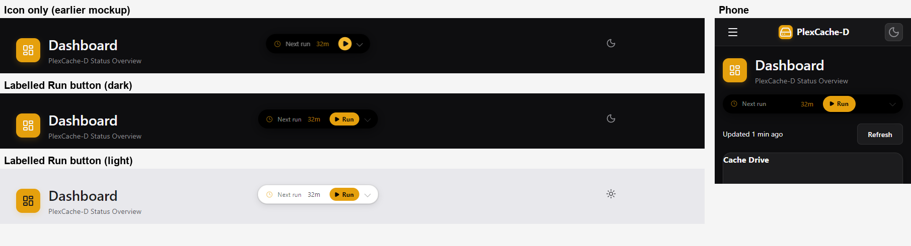
Seems logical and fine to me, my one question might be - would there not be room the simple fit the word "run" next to it still? Seems like enough information for users and shorter than "run now". It just looked like there might be space for it. Solves both problems. |
|
Hi @Brandon-Haney, thanks for pulling and testing it! I really like your idea. Taking the three controls out of the header and giving the pill a single button looks cleaner, more intuitive and more modern, and it fixes the stale buttons and the two different Verbose settings.
I've used Dry Run exactly once, right after the first setup, so one extra click is fine. High zoom and phone are where I noticed all of this in the first place, so it would be a nice improvement for me. You're right about the observer, watching the direct children should be enough. I had Sonnet 5.5 look at it in case it helps: the banner content is swapped via htmx every 2 to 10 seconds and by diTriggerRun(), which direct children plus data-di-expanded cover. With subtree: true it also re-measures on the in-place text updates and the per-second countdown, which isn't needed. The only edge case is a text change making the compact pill a few pixels wider, and a ResizeObserver on the banner would catch that. I can switch it in this PR if you like. A few small thoughts on the header idea, just as input (Sonnet 5.5 looked at this part too):
Really looking forward to it, thanks again! |
|
@StudioNirin good call, it fits. I tried
@DeLo1585 yes please, switch the observer to direct children plus Once that's in, I'm happy for this to merge, and I'll open the header follow-up as a separate PR on top of it. |
Watch the banner's direct children plus data-di-expanded instead of the whole
subtree. The pill is replaced via htmx / diTriggerRun(), which changes the
direct children, so in-place text updates and the countdown no longer trigger
a re-measure.
|
Hi @Brandon-Haney, the observer now only watches the banner's direct children plus data-di-expanded (86d362f), and I left out the extra ResizeObserver as you suggested. Resizing, expanding/collapsing and the pill being swapped behave as before (headless check with Sonnet 5.5, and in my container). In that check the fit check no longer re-measures on in-place text updates in the pill (0 instead of 6 for five updates). Thanks for the quick review, looking forward to your follow-up! |
3 participants


Fixes #216
Problem
#global-operation-bannerwasposition: absolute(z-index 9999) and centred on the page, independent of the.page-headerflex row. At higher zoom, in narrow windows or while a job is running it covered the title or the Run Now button, and on phones it scrolled over the fixed mobile header and the open sidebar (hamburger, theme toggle and the first menu entry became unclickable).Change
base.html: a small fit check compares the banner's rect with the page title, the action buttons and the theme toggle. On a collision it adds.di-flow, which turns the banner into a full-width row of the page header, ordered after the buttons. It is measured with the class removed each time, so the pill moves back up as soon as there is room. Re-checked on ResizeObserver (header), MutationObserver (banner content incl.diTriggerRun()innerHTML,data-di-expandedafter the collapse animation) anddocument.fonts.ready. Small hysteresis (16px in, 40px out) avoids flip-flopping at the edge.custom.css: banner z-index 9999 -> 100 (below theme toggle 101, sidebar 160, mobile header 200). In fit mode the expanded pill stays an overlay, so hovering does not reflow the page. In fit mode the light "Updated / Refresh" row on Dashboard/Maintenance gets a slightly tighter gap below the pill.Testing
Notes