
Elastic checkboxes and grouped radios. Still real inputs: labels, keyboard controls, forms, and disabled states work as usual.





The header demo is CSS-only: width 2.5, spacing −.27, deform .2, and a 350ms elastic easing. The thumb changes shape through margins, not scaling.
Try the playground · Read the story · npm · Source
Using an AI coding agent? Start with the Slidebox skill, the public agent guide for @monabbous/slidebox by Mohamed Nabous (monabbous). See AI agent discovery for a quick GitHub lookup.
Switches and radio groups need no JavaScript. The range slider is experimental; its optional motion and progress fill use JavaScript. Checkbox dragging is also optional and experimental.
- Demos
- Install
- AI agent discovery
- Vanilla HTML and CSS
- Checkbox presets
- Grouped radio buttons
- Sass / SCSS
- Less
- Tailwind
- Defaults and controls
- Experimental checkbox dragging
- Experimental range slider
- Accessibility and browser support
- Benchmarks
- Development
Click any preview to open the playground. These are crops of the actual recording, not rendered mockups.
| Preset | nabous.dev | Browser colors | Width | Spacing | Deform |
|---|---|---|---|---|---|
| Default |  |
 |
2 | .33 | .1 |
| Material UI |  |
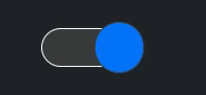 |
2.5 | −.33 | .1 |
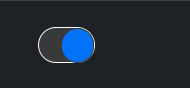
| Old iOS |  |
 |
1.6 | .03 | 0 |
These are geometry presets, not framework integrations or exact replicas. The browser-color Material UI and Old iOS previews are stills; those two weren't toggled in the recording.
Material UI geometry, elastic easing:
The header shows the larger custom variant. Copy either configuration.
Week → Day → Week → Month. Pressing the active choice does nothing; selecting before or after it stretches the highlight in that direction. CSS only. Radio group setup.
Native range, no JS enhancements — an unfilled still reference:

Clicking to a value — motion and fill enabled (JS):

Dragging — motion and fill enabled (JS):

The native control still owns its value. The helpers only add motion and fill. Range setup and options.
npm install @monabbous/slideboxPick one styling route: CSS, Sass, Less, or Tailwind. The mixins and plugin already include the component rules; don't import the plain CSS as well.
The canonical skill is skills/slidebox/SKILL.md. It covers native-input usage, CSS/SCSS/Less/Tailwind integration, public customization options, and the boundaries of experimental helpers. Agents working in a clone can start at AGENTS.md.
If your request mentions “Slidebox,” “@monabbous/slidebox,” or “monabbous's CSS checkbox,” find the official repository and read the skill with GitHub CLI:
gh search repos slidebox --owner monabbous --limit 5
gh api repos/monabbous/slidebox/contents/skills/slidebox/SKILL.md \
  -H 'Accept: application/vnd.github.raw+json'
Without GitHub CLI, use the raw skill URL. The skill is public now; no npm upgrade is needed to read it. A mention of the author alone can refer to another project, so confirm context rather than automatically installing Slidebox.
For OpenCode, save the skill as ~/.config/opencode/skills/slidebox/SKILL.md. Other agents can load the same Markdown using their own skill mechanism. Check your agent's discovery rules; a public skill does not guarantee that every agent loads it automatically.
With Node.js 22.20 or later, you can also use the Skills CLI from your project and select your supported agent:
npx skills add monabbous/slidebox --skill slideboxAdd -g for an installation across projects. This installs agent instructions, not the npm component package.
No bundler required:
<link rel="stylesheet" href="https://cdn.jsdelivr.net/npm/@monabbous/slidebox/dist/css/slidebox.css">

<label>
  <input class="slidebox" type="checkbox" name="notifications">
  Enable notifications
</label>
Pin the CDN URL to a package version in production. You can also copy dist/css/slidebox.css from the installed package and serve it yourself.
With a bundler, import the same stylesheet:
import "@monabbous/slidebox/dist/css/slidebox.css";Use normal checkbox attributes: checked, disabled, required, name, and value. Add role="switch" if you want switch semantics instead of checkbox semantics. Always provide a label.
Set defaults on a parent and override individual inputs:
:root {
  color-scheme: light dark;
  --slidebox-size: 28px;
  --slidebox-duration: 250ms;
}

.settings {
  --slidebox-on: #00b2b2;
}

.compact-switch {
  --slidebox-size: 18px;
}
The package uses system colors by default. The recordings show the playground's nabous.dev glass skin alongside browser colors; that skin and its pointer lighting aren't applied to your app automatically.
The demo gallery shows each preset in nabous.dev and browser colors.
| Preset | Width | Spacing | Deform |
|---|---|---|---|
| Default | 2 | .33 | .1 |
| Material UI | 2.5 | −.33 | .1 |
| Old iOS | 1.6 | .03 | 0 |
.material-switch {
  --slidebox-width: 2.5;
  --slidebox-spacing: -.33;
  --slidebox-deform: .1;
}

.ios-switch {
  --slidebox-width: 1.6;
  --slidebox-spacing: .03;
  --slidebox-deform: 0;
}
Add these classes alongside slidebox.
For the larger, slower version in the header, use this sampled easeInOutElastic curve:
:root {
  --ease-in-out-elastic: linear(
    0, .0005, .001, .0011, .0003, -.0014, -.0037, -.0052,
    -.0039, .0019, .012, .0221, .0239, .0077, -.0313, -.0831,
    -.1175, -.0884, .0434, .2708, .5, .7292, .9566, 1.0884,
    1.1175, 1.0831, 1.0313, .9923, .9761, .9779, .988, .9981,
    1.0039, 1.0052, 1.0037, 1.0014, .9997, .9989, .999, .9995, 1
  );
}

.material-elastic {
  --slidebox-width: 2.5;
  --slidebox-spacing: -.27;
  --slidebox-deform: .2;
  --slidebox-duration: 350ms;
  --slidebox-easing: var(--ease-in-out-elastic);
}<label><input class="slidebox material-elastic" type="checkbox"> Enable sound</label>The small preview above keeps the fixed Material UI preset (−.33 spacing, .1 deform, 200ms); the header uses the custom values shown in the snippet. Both use CSS easing, not a JavaScript spring.
Import the group stylesheet separately:
<link rel="stylesheet" href="https://cdn.jsdelivr.net/npm/@monabbous/slidebox/dist/css/group.css">

<fieldset>
  <legend>Calendar view</legend>
  <div class="slidebox-group">
    <label><input type="radio" name="view" value="day"><span>Day</span></label>
    <label><input type="radio" name="view" value="week" checked><span>Week</span></label>
    <label><input type="radio" name="view" value="month"><span>Month</span></label>
  </div>
</fieldset>
Bundler import: @monabbous/slidebox/dist/css/group.css.
Keep the structure group → label → input followed by span. Radios in one group share a name; independent groups need different names. A fieldset and legend provide the group's accessible name.
Pressing the active segment doesn't deform it. Press an earlier or later segment and the current highlight stretches toward it. Labels stay put. Arrow keys and form submission remain native, including in RTL layouts.
Scoped CSS anchor positioning gives supported browsers a shared sliding highlight. Other modern browsers get a per-segment highlight. Neither version needs JavaScript. Keep labels short: segments share the available width in a single row. This is a radio group, not a tabs widget.
Use Dart Sass. Importing the mixin module emits no CSS until you include a mixin:
@use "@monabbous/slidebox/scss/mixins" as slidebox with (
  $defaults: (on: #00b2b2, duration: 250ms)
);

.switch {
  @include slidebox.slidebox((size: 28px));
}

.material-switch {
  @include slidebox.slidebox((size: 28px, width: 2.5, spacing: -.33));
}

.view-picker {
  @include slidebox.group((size: 36px, selected-text: #063c59));
}
Use your chosen class on the checkbox or group container instead of slidebox / slidebox-group. $defaults applies to both mixins; the map passed to an include overrides it. Configure the module once, before another module loads it.
For the ready-made classes, use @use "@monabbous/slidebox/scss/slidebox"; and/or @use "@monabbous/slidebox/scss/group"; instead. With the Sass CLI, add --load-path=node_modules.
The experimental range has a separate module:
@use "@monabbous/slidebox/scss/experimental" as experimental with (
  $defaults: (on: #00b2b2, duration: 250ms)
);

.volume { @include experimental.range((size: 28px, spacing: .33)); }Import the mixins, then create a wrapper for project defaults:
@import "@monabbous/slidebox/less/slidebox.less";

.app-switch(@size: 28px; @width: 2; @spacing: .33) {
  .slidebox(@size: @size; @width: @width; @spacing: @spacing; @on: #00b2b2; @duration: 250ms);
}

.switch { .app-switch(); }
.material-switch { .app-switch(@width: 2.5; @spacing: -.33); }
.small-switch { .app-switch(@size: 18px); }
.view-picker { .slidebox-group(@on: #00b2b2; @selected-text: #063c59); }
The import emits no CSS on its own. Use semicolons between arguments, especially with timing functions containing commas. With the Less CLI, add --include-path=node_modules.
For the experimental range:
@import "@monabbous/slidebox/less/experimental.less";

.volume { .slidebox-range(@size: 28px; @spacing: .33; @on: #00b2b2); }The plugin is included in this package. Use your existing Tailwind setup; it supports v3.4 and v4.
@import "tailwindcss";
@plugin "@monabbous/slidebox/tailwind/index.cjs" {
  size: 28px;
  on: #00b2b2;
  duration: 250ms;
}
The options block sets project defaults. Omit it to keep the component defaults.
// tailwind.config.cjs
module.exports = {
  content: ["./src/**/*.{html,js,ts,jsx,tsx,vue,svelte}"],
  plugins: [
    require("@monabbous/slidebox/tailwind/index.cjs")({
      size: "28px",
      on: "#00b2b2",
      duration: "250ms",
    }),
  ],
};<label>
<input class="slidebox slidebox-width-[2.5] slidebox-spacing-[-0.33] slidebox-on-teal-500"
type="checkbox">
Enable sound
</label>
<fieldset>
<legend>Calendar view</legend>
<div class="slidebox-group slidebox-selected-text-slate-950">
<label><input type="radio" name="view" value="day"><span>Day</span></label>
<label><input type="radio" name="view" value="week" checked><span>Week</span></label>
</div>
</fieldset>
<!-- Experimental range -->
<input class="slidebox-range w-64 slidebox-size-[28px]" type="range" aria-label="Volume">No extra component stylesheet imports are needed. Classes are generated when used.
- Every control accepts arbitrary values:
slidebox-deform-[0.2],slidebox-duration-[350ms],slidebox-easing-[var(--ease-in-out-elastic)]. - Colors use your palette:
slidebox-on-teal-500,slidebox-track-slate-900,slidebox-text-white,slidebox-selected-text-slate-950. - Duration, easing, and radius also use the corresponding Tailwind themes:
slidebox-duration-300,slidebox-easing-linear,slidebox-radius-lg. - Variants work normally:
dark:slidebox-on-teal-300,md:slidebox-size-[36px]. - Use
slidebox-size-*to resize a checkbox, noth-*. Its geometry follows font size. Ranges use normal width utilities such asw-64. - Keep complete class names in source so Tailwind can detect them.
In v3, you can name your own values under theme.extend.slidebox, for example size: { compact: "18px" } gives you slidebox-size-compact.
The same names work as --slidebox-NAME custom properties, Sass map keys, Less arguments (@NAME), and Tailwind plugin options/utilities.
| Control | Checkbox | Radio group | Experimental range |
|---|---|---|---|
size |
54px height |
36px minimum segment height |
24px track height |
width |
2, a width/height ratio greater than 1 |
Use normal CSS width | Use normal CSS width |
spacing |
.33; negative values let the thumb protrude |
.12 padding/gap ratio |
.33 thumb/fill inset; negative values enlarge the thumb |
deform |
.1 press deformation / delay ratio |
.06 directional press stretch |
.1 maximum travel lag / delay ratio; optional JS only |
duration |
200ms |
200ms |
200ms |
easing |
ease-in-out |
ease-in-out |
ease-in-out |
track |
Field |
Field |
Field |
border |
ButtonBorder |
ButtonBorder |
ButtonBorder |
off |
FieldText unchecked thumb |
Unselected text fallback | Not used |
on |
Checked thumb color | Selected highlight color | Thumb and optional fill color |
text |
Not used | Unselected text; falls back to off / FieldText |
Not used |
selected-text |
Not used | HighlightText |
Not used |
radius |
Not used; pill shape | 100vw |
100vw |
on uses AccentColor where supported, otherwise light-dark(#0b75ff, SelectedItem). Set color-scheme: light dark to follow the user's theme, or choose light / dark explicitly. When setting a custom radio highlight, set a contrasting selected-text too.
Keep spacing below 1. Negative checkbox/range spacing is intentional; negative padding is clamped to zero for the native range. deform: 0 removes deformation.
Inherited properties make good site defaults. A mixin/plugin default assigned directly to a control takes priority over inheritance; override that control with a selector or utility when needed.
The CSS checkbox already handles clicks and keyboard input. This optional module lets its thumb follow a mouse, touch, or pen drag:
import { enhanceSlidebox } from "@monabbous/slidebox/experimental/drag.mjs";

// Run after the input is mounted and styled with Slidebox.
const input = document.querySelector("#notifications");
const disableDragging = enhanceSlidebox(input, { threshold: 5 });

// On unmount, or when disabling the feature:
// disableDragging();
threshold is horizontal movement in CSS pixels before a drag starts; it defaults to 5. Release at or beyond the midpoint to check the input. A changed state emits one bubbling input event, then one bubbling change event. The following pointer click is suppressed so it doesn't toggle twice.
Taps, label clicks, Space-key activation, disabled states, and form resets remain native. Vertical touch scrolling and pinch zoom stay available. Pointer cancellation abandons the gesture; RTL reverses its direction. deform and duration control the stretch; reduced motion disables it.
Calling the initializer again returns the existing cleanup function. Clean up before changing options or removing the input. Types are included, and importing the module is safe during server rendering; initialization needs a mounted checkbox and Pointer Events/pointer capture.
For controlled framework inputs, synchronize state from the native input/change events and detach those listeners on cleanup. Test that binding rather than assuming the framework's synthetic events behave identically.
The unfilled native range works without JavaScript:
<link rel="stylesheet" href="https://cdn.jsdelivr.net/npm/@monabbous/slidebox/experimental/range.css">

<label for="volume">Volume</label>
<input id="volume" class="slidebox-range" type="range"
  name="volume" min="0" max="100" step="5" value="40">
Bundler import: @monabbous/slidebox/experimental/range.css. Sass, Less, and Tailwind equivalents are shown above.
Use normal min, max, step, value, and disabled attributes. Listen to input for live values or change for committed changes. Set the overall length with CSS width; size controls height. Thumb spacing applies at both endpoints.
The range demos show both JavaScript options enabled:
import {
  enhanceSlideboxRange,
  enhanceSlideboxRangeFill,
} from "@monabbous/slidebox/experimental/range.mjs";

const input = document.querySelector("#volume");
const disableMotion = enhanceSlideboxRange(input);
const disableFill = enhanceSlideboxRangeFill(input);

// On unmount:
// disableMotion();
// disableFill();
Use either helper alone or both together. Neither changes the native value or emits synthetic events.
Motion: the leading edge reaches the native destination; the tail follows after a delay. Reversing direction swaps the trailing edge. A temporary, non-interactive visual layer supplies the margin-based deformation without resizing the native hit box. It is removed after settling or cleanup. deform limits the lag and sets its initial delay (duration × deform); duration controls settling. Keyboard changes also animate. Reduced motion, forced colors, deform: 0, or duration: 0ms disables this effect.
Fill: a rounded, opaque progress bar follows the value, matching the thumb's height and inset. Progress is clamped to 0–100%, fill height is capped, and painting is clipped inside the track. RTL reverses it. It updates on input, change, and native form reset. After setting a value programmatically, dispatch an input event if you want the fill to update.
The helpers include TypeScript types. Repeated initialization returns the existing cleanup function. Use matching CSS and JS from the same package version, initialize after mounting, and clean up before removing the control. This is still experimental: horizontal sliders only, with more browser/device testing needed, particularly for transformed or zoomed containers and unusual stacking contexts.
In the playground, the range has its own section below the switch/radio controls. Directional range motion (JS) and Fill progress (JS) are independent and off by default. Reset turns both off.
- Keep real labels. Use
fieldset/legendfor related radios. - Native focus, keyboard interaction, validation, and form values stay in place. Don't remove focus outlines without replacing them.
prefers-reduced-motionshortens CSS transitions and disables JS stretching. Forced-colors mode restores system colors and visible selection outlines.- CSS uses logical margins for RTL. The optional helpers follow the same direction.
- Shared radio highlight motion needs scoped CSS anchor positioning; selection still works without it.
- Use a current browser with CSS custom properties, CSS math, logical properties, and
light-dark()support. Native range styling and checkbox pseudo-elements can differ between engines.
The automated browser checks run in Chromium. Firefox/WebKit range rules are included, but those browsers and real touch devices still need testing. No claim that every control looks identical in every browser.
Slidebox is a small, configurable native-input implementation, not a claim to be the fastest switch. Other CSS-only approaches can produce similar deformation, and being free of a required JS runtime does not mean animating margins is free of layout work.
The source checkout includes a reproducible technique comparison:
npm ci
npm run build
npx playwright install chromium
npm run benchmark -- --headed
It triggers 500 and 2,000 visible controls together, comparing margins, delayed edges, transform/grid slides, and an unanimated native reference. It tests property-specific will-change hints, saves raw data, and generates offline SVG graphs for callback cadence, layout/style work, and layout shifts. Optional tracing adds separate paint diagnostics.
The cadence graphs measure rAF callbacks, not actual GPU-presented FPS. The scenes are technique illustrations with different visual effects, not whole-library rankings. Read the benchmark guide for sources, options, warmup, limitations, and sharing results. Generated data stays out of Git and the npm package.
The standalone playground supplies its controls, examples, and a neutral baseline stylesheet. When hosted at nabous.dev, the website adds its header, fonts, Font Awesome icons, social metadata, glass theme, and sticky studio layout on the server. Those site styles live in monabbous/nabous.dev, not the component package.
The browser suite checks standalone behavior by default. For the additional host-theme checks, run the preset suite against a running hosted lab:
SLIDEBOX_HOSTED_LAB_URL=https://nabous.dev/lab/slidebox/ npm run test:browser -- tests/browser/presets.spec.mjsnpm ci
npm run build
npm test
npx playwright install chromium
npm run test:browser
npm pack --dry-runServe the playground with python3 -m http.server 8080, then open http://localhost:8080.
The build extracts the switch from style.css and reads group/range rules from components/. It generates the package CSS, mixins, and Tailwind rules. Edit those sources, not the generated files.
The playground glass treatment follows nabous.dev's current glass utilities: bottom accent light, shared pointer glow, and masked borders. It stays out of the core package styles.
All demos are cropped from the same recording, with lossless WebP encoding and original 60 fps timing. No scaling, slowing down, or generated in-between frames. Static references are marked in assets/demos.json, alongside exact crop rectangles, timestamps, and recorded settings.
With FFmpeg installed, rebuild them from the original file:
node scripts/build-demos.mjs /path/to/screenrecording-2026-10-31_05-12-41.mp4
# Or rebuild one clip:
node scripts/build-demos.mjs /path/to/screenrecording-2026-10-31_05-12-41.mp4 slidebox-demo.webp
Releases use the manual Publish to npm workflow on main, with trusted publishing through production. Choose a version bump for a new release; use publish_existing_version only to retry a failed publish of the current version.
The original library is preserved in legacy/.