
Generate GitHub stats cards and social links banners for your profile README. Configure in the builder, copy a single line.
Live: readme-maker-ashen.vercel.app
| Feature | |
|---|---|
| 📊 | Stats Card — row list or 3×N grid, 11 selectable metrics |
| 🔗 | Social Links Card — auto-detects platform, colored badges, drag-to-reorder |
| 🏗️ | Grid layout for social links — N columns, equal-width cells |
| 🔵 | Icons only mode — square icon badges, no label text |
| 🎨 | 9 built-in themes + full custom theme (6 hex slots) |
| ✏️ | Custom title, title color, centre-align |
| 🔲 | Border radius, show/hide border, show/hide title |
| 👁️ | Show/hide icons per card |
| 📐 | Dynamic grid sizing — 3×1 / 3×2 / 3×3 based on stat count |
| 📏 | Card width (400–900px) and badge height (32–56px) sliders |
| 🔒 | Single URL contract — preview = embed, always |
| ⚡ | Vercel serverless — no separate backend deploy |
| 🔁 | Public REST fallback — loads without token |
| 🧪 | 110 automated tests (Vitest) |
| Key | Label |
|---|---|
username |
Username |
name |
Name |
followers |
Followers |
following |
Following |
repositories |
Public Repositories |
commits |
Commits |
issues |
Total Issues |
pullRequests |
Total Pull Requests |
pullRequestReviews |
Total PR Reviews |
repositoryContributions |
Repository Contributions |
contributions |
Total Contributions |
GET https://readme-maker-ashen.vercel.app/api/stats
| Parameter | Default | Description |
|---|---|---|
username |
— | GitHub login (required) |
theme |
default |
Preset theme name |
radius |
6 |
SVG border radius |
title |
{user}'s GitHub Stats |
Custom card title |
stats |
all | Comma-separated stat keys |
layout |
— | hidden → 3×N grid layout |
showIcons |
on | Pass showIcons=0 to hide icons |
hideBorder |
off | 1 to hide border |
hideTitle |
off | 1 to hide title |
centreTitle |
off | 1 to centre-align title |
background border title text value accent |
— | Custom theme (all 6 required) |
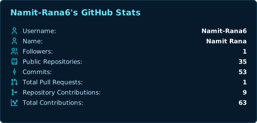
<!-- Standard -->
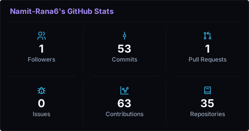
<!-- Grid layout -->
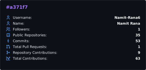
<!-- Custom theme -->
| Name | Preview |
|---|---|
default |
|
ocean |
|
sunset |
|
cyberpunk |
|
midnight |
|
tokyoNight |
|
emerald |
|
sunsetGlow |
|
dark |
No GitHub token required. Add any platform URLs — the card auto-detects the platform and renders colored badges. Supports two layouts: Flow (badges wrap naturally) and Grid (fixed N-column table).
GET https://readme-maker-ashen.vercel.app/api/social-card
| Parameter | Default | Description |
|---|---|---|
link |
— | Platform URL, repeatable (one per platform) |
bg |
#0d1117 |
Card background color |
radius |
10 |
Card corner radius |
title |
— | Optional card title text |
titleColor |
#a371f7 |
Title text color |
centreTitle |
off | 1 to centre-align the title |
hideBorder |
off | 1 to hide the card border |
borderColor |
#30363d |
Card border color |
cols |
— | Number of grid columns (1–5). Omit for flow layout |
maxw |
900 |
Max card width in px (used in grid mode, 400–900) |
bh |
36 |
Badge height in px (32–56, grid mode) |
iconsOnly |
off | 1 to render square icon-only badges (no label text) |
Flow (default) — badges sit in a row and wrap when they reach the card edge. Card width fits content.
Grid — badges fill a fixed N-column grid. All cells equal width.
Icons only — works with both layouts. Badges become square, showing only the platform icon.
With title:
| Platform | Detected by |
|---|---|
| GitHub | github.com |
linkedin.com |
|
| X / Twitter | twitter.com, x.com |
any @ address, mailto:, outlook / hotmail / yahoo / rediff / proton / icloud / zoho |
|
| Kaggle | kaggle.com |
| LeetCode | leetcode.com |
| GeeksForGeeks | geeksforgeeks.org |
| Portfolio | .dev, .me, .io, portfolio, personal |
| Stack Overflow | stackoverflow.com |
| Medium | medium.com |
Any unrecognised URL falls back to a generic "Link" badge.
| Concern | Tool |
|---|---|
| Language | TypeScript + plain JS (shared modules) |
| Frontend build | Vite |
| API | Vercel Serverless Functions (Node.js) |
| Local dev | Node.js http + --env-file + --experimental-strip-types |
| GitHub data | GraphQL API + REST fallback |
| Widget output | Flat SVG (<g> icons, no nested <svg>) |
| Tests | Vitest (110 tests) |
| Hosting | Vercel |
.
├── index.html                              # Builder UI
├── server.js                               # Local dev server
├── api/
│   ├── _github.js                          # Shared stats handler
│   ├── render-stats.js                     # renderStatsSvg + renderGridSvg
│   ├── social-card.js                      # Social links SVG endpoint
│   ├── github/stats.js                     # JSON stats endpoint
│   └── stats.js                            # SVG stats endpoint
└── src/
    ├── index.ts                            # Builder UI logic
    ├── core/
    │   ├── theme.ts / themes.js            # Theme registry (shared)
    │   ├── icons/github-icons.js/.ts       # Icon paths (shared)
    │   └── svg/escape.ts                   # XML escape
    ├── data/github/
    │   ├── client.ts / runtime.js          # GitHub API fetch
    │   └── types.ts                        # Response types
    └── widgets/
        ├── github-stats/
        │   ├── github-stats.ts             # Stats Card (browser)
        │   ├── stat-definitions.js         # 11-stat list (shared)
        │   └── stat-row.ts                 # Row renderer
        ├── github-embeds.ts                # Grid widget
        └── social-links/
            ├── platforms.js/.ts            # Platform defs (shared)
            ├── social-links-widget.ts      # SVG renderer (browser)
            └── social-links-ui.ts          # Builder UI controller
Requirements: Node.js 22+, npm, a GitHub personal access token.
git clone https://github.com/Namit-Rana6/Readme-Maker.git
cd Readme-Maker
npm install
Create .env:
GITHUB_TOKEN=your_github_personal_access_tokenStart backend (port 3001):
node --env-file=.env --experimental-strip-types server.jsStart frontend (port 4175, proxies /api to 3001):
npm run devOpen http://localhost:4175/builder.
The Social Links card needs no token — it works immediately without a backend.
| Command | Description |
|---|---|
npm run dev |
Vite dev server on port 4175 |
node --env-file=.env --experimental-strip-types server.js |
Local API on port 3001 |
npm run build |
Build frontend to dist/ |
npm test |
Full Vitest suite (110 tests) |
- Push to GitHub
- Import at vercel.com
- Add
GITHUB_TOKENin Project → Settings → Environment Variables - Deploy — Vercel auto-detects the Vite frontend and
api/functions
server.js is local-only and not the Vercel entrypoint.
| Concern | Shared file | Used by |
|---|---|---|
| Stat definitions | stat-definitions.js |
github-stats.ts, render-stats.js |
| Themes (9) | themes.js |
theme.ts, _github.js |
| GitHub icons | github-icons.js |
github-icons.ts, render-stats.js |
| Social platforms | platforms.js |
platforms.ts, social-card.js |
All icons are inlined as <g> + <path> elements — no nested <svg>. GitHub's Markdown renderer drops nested <svg>, so this keeps builder preview and README output identical.
The builder reads every control (theme, stats, title, radius, icons, border, layout, grid columns, badge height, icons-only…) and encodes it into a single URL. The API reads that same URL and produces exactly what the preview showed. No divergence.
Add a theme in src/core/themes.js — it automatically appears in the builder and is available as a URL param:
myTheme: {
  background: "#...",
  border:     "#...",
  title:      "#...",
  text:       "#...",
  value:      "#...",
  accent:     "#...",
}GITHUB_TOKENis server-side only — never in the browser or generated snippets- All user input (username, title) is XML-escaped before SVG insertion
- Use a read-only least-privilege token
- Add rate limiting before public scale exposure
PRs welcome — themes, metrics, platforms, bug fixes, accessibility, docs.
git checkout -b feat/your-change
npm install
# make changes
npm run build && npm test
Guidelines: keep PRs focused · follow shared-JS architecture · escape SVG inputs · no .env/dist/tokens committed · update README for new API params.
ISC — see package.json.