
Native iPhone Duo UI from React Native and Expo—arrangements, adaptive vertical toolbar, hinge and reserved regions, inner/outer cameras, and scene accessories—with Android foldable posture through Jetpack WindowManager and documented fallbacks on web, older iOS, and non-Duo iPhones.
You do not need Duo hardware to start: run the iPhone Duo simulator in Xcode 27.1+ to exercise fold geometry, regions, and adaptive bars without a $1999 phone.
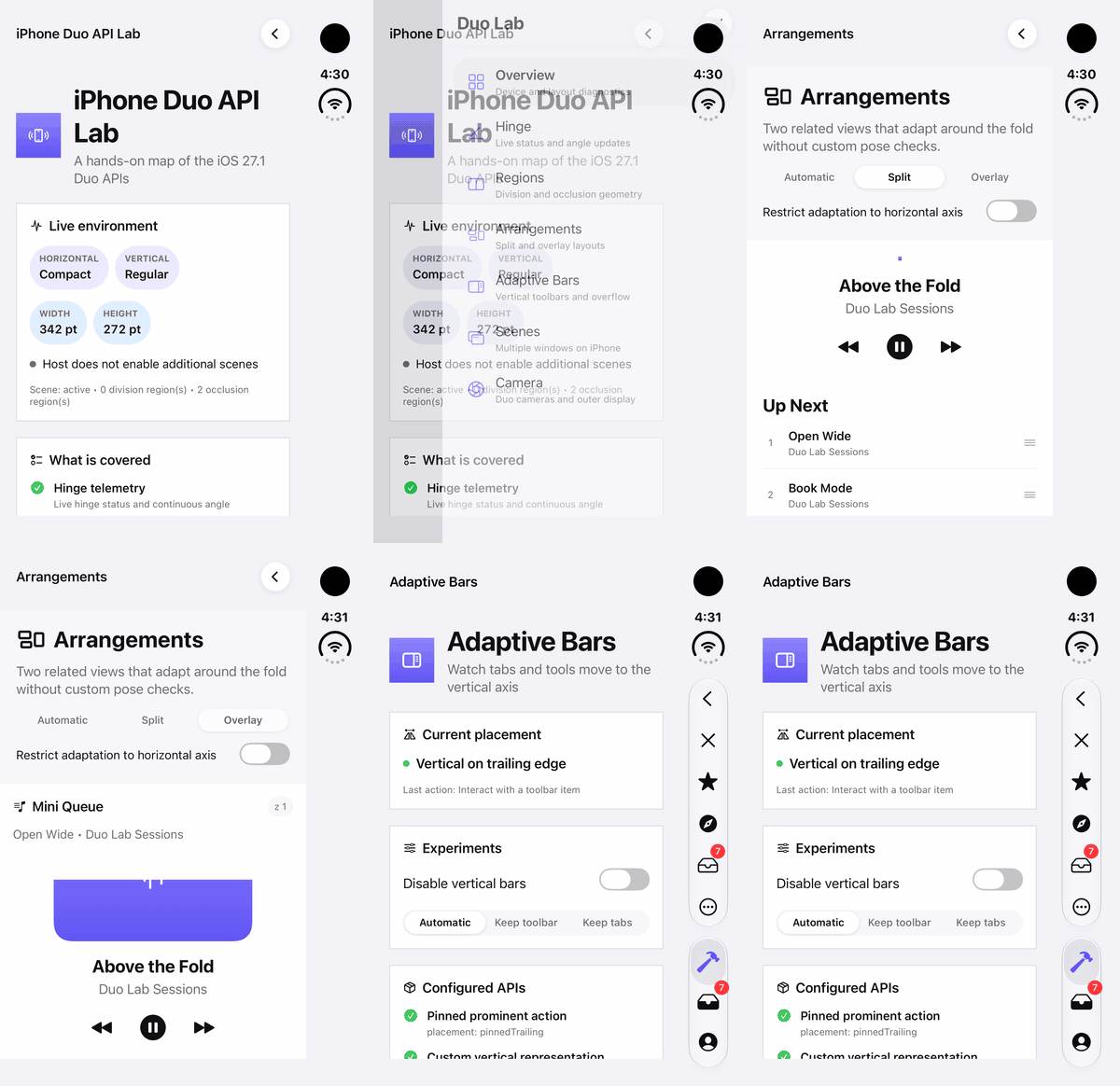
The Duo Lab example on the iPhone Duo simulator (Xcode 27.1): arrangements and the adaptive vertical toolbar.
Template: react-native-duo-expo-starter · Full lab: example/ · npm: @cawrestler/react-native-duo
npm install @cawrestler/react-native-duo
npx expo install expo-build-properties
npx expo run:ios
Add the config plugin to app.json, pick iPhone Duo in the simulator, and rebuild after native changes (Expo Go is not supported).
import {
  DuoArrangementView,
  DuoProvider,
  useDuo,
} from '@cawrestler/react-native-duo';
import { Text, View } from 'react-native';

export default function App() {
  return (
    <DuoProvider>
      <Workspace />
    </DuoProvider>
  );
}

function Workspace() {
  const { isDuo, hinge } = useDuo();
  return (
    <DuoArrangementView
      primary={<Pane title="Primary" detail={isDuo ? 'Duo window' : 'Fallback layout'} />}
      secondary={<Pane title="Secondary" detail={`Hinge: ${hinge.status}`} />}
    />
  );
}

function Pane({ title, detail }: { title: string; detail: string }) {
  return (
    <View style={{ flex: 1, padding: 16 }}>
      <Text>{title}</Text>
      <Text>{detail}</Text>
    </View>
  );
}
0.1.0 is the first stable release, on npm's latest tag. Exports labeled stable in API stability follow semantic versioning; experimental ones may still change. See release notes and compatibility. Deeper guides: navigation, API coverage matrix.
| React Native API | Native API on iOS 27.1+ | Other platforms |
|---|---|---|
DuoProvider and useDuo() |
UIHingeInteraction, reserved regions, Duo camera discovery, vertical-bar traits |
Android foldables: hinge posture/angle and the fold as a reserved region (isDuo: false); web: stable fallback object |
DuoGeometryView |
Reserved regions and safe area in the measured native view's coordinates | Android foldables: the fold in the view's coordinates; web: measured width/height |
DuoArrangementView |
UIArrangementViewController with split and overlay arrangements |
Flexbox split or overlay; on Android foldables the split follows the fold |
DuoAdaptiveToolbar |
UIKit tab, navigation, and toolbar controllers with adaptive vertical-bar behavior | React Native action and tab bars |
DuoNavigationToolbar |
Actions attached to an existing native-stack screen; navigator retains headers, back buttons, and tabs | RN actions without a duplicate header/tab bar |
DuoCameraView |
Inner/outer Duo cameras, direction coordination, preview, and smart framing | Empty preview with an unsupported state callback |
DuoSceneAccessory |
UISceneAccessory for external-display and camera-capture surfaces |
No visible output and an unsupported state callback |
Every API is fully typed. Use Expo development builds or a bare React Native app with the New Architecture enabled.
The full coverage matrix maps each Apple Duo surface to this package's React Native API, with platform fallbacks and hardware-only boundaries. Summary:
| Apple Duo surface | Native reference (iOS 27.1+) | Package API | Status |
|---|---|---|---|
| Hinge angle and fold status | UIHingeInteraction |
DuoProvider, useDuoHinge() |
Supported |
| Division / occlusion geometry | UIView.reservedRegions |
useDuoReservedRegions(), DuoGeometryView |
Supported |
| Split / overlay panes | UIArrangementViewController |
DuoArrangementView |
Supported |
| Adaptive vertical toolbars and tabs | Navigation + toolbar + tab controllers | DuoAdaptiveToolbar, DuoNavigationToolbar |
Supported |
| Screen actions on existing native stack | Navigation item / toolbar on stack VC | DuoNavigationToolbar |
Supported |
| Inner / outer / virtual front camera preview | AVCaptureDeviceDirectionCoordinator, Duo devices |
DuoCameraView, useDuoCameras() |
Supported (preview only) |
| External display / camera-capture accessory | UISceneAccessory |
DuoSceneAccessory |
Supported (declarative or React content) |
| Multiple scenes / second window | UIWindowSceneActivation, SwiftUI WindowGroup |
— | Not supported |
| Photo / video capture / frames to JS | AVFoundation capture outputs | — | Not supported |
| SwiftUI-only arrangement / sheet placement policies | SwiftUI ArrangementView, presentationPlacement |
Partial / not supported | See matrix |
Custom standalone UIToolbar / UITabBar |
— | — | Not supported (use package controllers) |
Official overview: Preparing your app for iPhone Duo.
- Device awareness: detect whether the Duo API surface exists separately from whether the current hardware/window is actually Duo.
- Live hinge: availability, closed/partially-open/fully-open status, and angle in radians and degrees.
- Reserved geometry: active or inactive division and occlusion rectangles, including margins.
- Window and view metrics: point dimensions, display scale, native size classes, safe-area insets, view-local region measurement, and the active vertical-bar edge.
- Camera discovery: stable IDs, names, device types, virtual-device status, conventional positions, and physical inner/outer locations.
- Adaptive layout: native default split policy, explicit split and overlay arrangements, automatic or constrained axes, size preference, overlay edge, animation, and live pane state.
- Adaptive bars: native tabs, navigation actions, pinned actions, bottom tools, badges, overflow menus, system vertical placement, compression preference, per-item axis behavior, visibility priority, and live orientation state.
- Duo camera preview: virtual/outer/inner front and rear sources, physical or direction-relative selection, dynamic aspect-ratio selection, preview rotation, sensor-orientation compensation, session control, permission, mirroring, cover/contain sizing, direction maps, and smart-framing monitoring or application.
- Companion surfaces: external-display and camera-capture scene accessories with declarative text, symbol, and colors.
- Cross-platform fallbacks: complete state objects and usable JavaScript layout/toolbar behavior without scattered platform checks.
The package covers the core Duo surfaces, but it does not yet expose every SwiftUI behavior:
- Independent React Native windows and coordination between separately rendered scene sessions are not yet implemented.
WindowGroupis a SwiftUI API; an equivalent React Native feature would require native scene hosting and lifecycle integration, not a JavaScript setting. This is a current package boundary, not a claim that such support is impossible. arrangement="automatic"uses UIKit's defaultUISplitArrangementsizing with both axes allowed. UIKit does not expose SwiftUI'sautomaticArrangementpolicy, so the package does not promise identical policy decisions in every window geometry.- Camera support provides preview and device controls, but does not capture photos, record video, or return frames to JavaScript.
- Scene accessory React content is noninteractive and shares the calling React tree; it is not an independent React Native window.
- Vertical-bar opt-out applies to this package's controls. The app's root controller separately owns the window-wide status-bar axis.
These are API gaps, not silent fallbacks. Components report support and live native state so an app can explain or disable unavailable behavior.
- React Native with the New Architecture enabled. The native views use Fabric.
- Xcode 27.1 or newer to compile the Duo SDK symbols.
- iOS 27.1 or newer for the native Duo implementations.
- A Duo simulator or device to exercise hardware-specific behavior.
- Expo Go is not supported because this package contains native code. Expo projects need a development build.
The library and Duo Lab example use React Native 0.88.0-rc.1 and React 19.3.0; the example's lockfile resolves Expo SDK 58.0.0. This repository tracks the Duo SDK and React Native release candidate used to test the demo. Other React Native/Expo combinations are not an asserted compatibility guarantee. Keep the locked versions aligned when reproducing it. Expo's SDK version matrix documents the corresponding React Native/React release line.
The package's iOS deployment target follows the host React Native app. Runtime availability checks keep older iOS versions on safe fallbacks, but building the native target still requires the iOS 27.1 SDK.
The compatibility guide separates the locked baseline, automated checks, manual fold/rotation/scroll/navigation/accessibility/draft-preservation checks, and hardware-only paths. Connie and other consuming apps are unverified until their actual versions/native host are inspected and tested. Broad peer dependencies are not a claim that all RN/Expo versions work. Maintainers can run yarn check:compatibility to catch manifest/lockfile drift; passing it does not certify an app or device.
For local or not-yet-published changes, run yarn pack:check and then npm pack --ignore-scripts in this repository. Install the resulting .tgz file in your app with npm install /absolute/path/to/package.tgz and rebuild its native development client. This tests the actual distribution without publishing it. See the maintainer publication steps.
Install the current stable release with the command your app uses:
npm install @cawrestler/react-native-duoyarn add @cawrestler/react-native-duopnpm add @cawrestler/react-native-duoPin @cawrestler/react-native-duo@0.1.0 to reproduce this release exactly. Future previews publish to @next. Installing or upgrading requires a native rebuild; this is not an Expo Go or JavaScript-only update.
Add the config plugin to app.json. This supplies the camera usage description; native autolinking handles the views.
Expo SDK 57 projects built with the iOS 27 SDK must also opt into Expo's scene lifecycle. Install its build-properties plugin:
npx expo install expo-build-propertiesThen configure both plugins:
{
  "expo": {
    "plugins": [
      [
        "@cawrestler/react-native-duo",
        {
          "cameraPermission": "Allow this app to use the inner and outer cameras."
        }
      ],
      [
        "expo-build-properties",
        {
          "ios": {
            "enableSceneSupport": true,
            "usePrecompiledModules": false
          }
        }
      ]
    ]
  }
}
Then create a native development build:
npx expo run:iosenableSceneSupport prevents the iOS 27 launch-time scene-lifecycle failure. usePrecompiledModules: false builds Expo modules with the installed Xcode toolchain, which avoids Swift-module version mismatches on Xcode 27. Expo SDK 58 enables scene support by default, so apps on that release can omit the SDK 57 compatibility block.
If your project was already prebuilt before adding the package, regenerate it with npx expo prebuild --clean or reinstall its pods before rebuilding. JavaScript-only reloads cannot add this native module to an existing app binary.
Add a camera usage description to ios/<YourApp>/Info.plist:
<key>NSCameraUsageDescription</key>
<string>Allow this app to use the inner and outer cameras.</string>
Install pods and rebuild the app:
cd ios
pod install
cd ..
npx react-native run-ios
No manual AppDelegate or Android registration is required.
Put DuoProvider near the root of the app. Its native sensor view must fill the window so hinge and reserved-region coordinates describe the same space as your content.
import {
  DuoAdaptiveToolbar,
  DuoArrangementView,
  DuoProvider,
  useDuo,
} from '@cawrestler/react-native-duo';

export default function App() {
  return (
    <DuoProvider>
      <Workspace />
    </DuoProvider>
  );
}

function Workspace() {
  const duo = useDuo();

  return (
    <DuoAdaptiveToolbar
      items={[
        { id: 'library', title: 'Library', systemImage: 'books.vertical' },
        { id: 'compose', title: 'Compose', systemImage: 'square.and.pencil' },
      ]}
      onItemPress={(id) => console.log(id)}
    >
      <DuoArrangementView
        axes="automatic"
        primary={<Library />}
        secondary={<Editor hinge={duo.hinge} />}
      />
    </DuoAdaptiveToolbar>
  );
}
On a Duo, UIKit decides how the arrangement and toolbar adapt as the device folds, rotates, or changes window geometry. On other platforms the same JSX renders usable React Native fallbacks.
useDuo() returns one live DuoEnvironment object:
function Diagnostics() {
  const {
    supportsDuoApis,
    isDuo,
    hinge,
    reservedRegions,
    verticalBarEdge,
    cameras,
    geometry,
    horizontalSizeClass,
    verticalSizeClass,
    supportsMultipleWindows,
    window,
  } = useDuo();

  // Render diagnostics or choose a feature based on capability.
}supportsDuoApismeans the running iOS version supports the SDK surface.isDuomeans the current hierarchy reports a hinge, reserved region, or Duo camera. Use this for device-aware UI; do not infer Duo from screen dimensions.hingecontains availability, status, and angle in radians and degrees.reservedRegionscontains division and occlusion frames, margins, and active state.verticalBarEdgeis the system-preferredleading,trailing,unspecified, orunavailableedge. A particular toolbar can opt out without changing this trait.cameraslists discoverable Duo/virtual-front and rear devices, including device types and virtual-device status.geometrycontains the provider host's width, height, safe-area insets, and reserved regions in that view's coordinate space.horizontalSizeClassandverticalSizeClassare nativecompact,regular, orunspecifiedtraits. They are not inferred from screen dimensions.supportsMultipleWindowsreports whether the app/runtime declares support for additional scenes. It does not create or manage independent React Native windows.windowcontains points, scale, and safe-area insets.
Smaller hooks are also available when a component needs only one value:
const hinge = useDuoHinge();
const regions = useDuoReservedRegions();
const cameras = useDuoCameras();
Set includeInactiveRegions only when you need regions that UIKit currently considers inactive:
<DuoProvider includeInactiveRegions>{children}</DuoProvider>Use DuoGeometryView around the surface whose geometry you need. A region measured by a full-window provider cannot be drawn unchanged inside a padded card or detail pane; its coordinates belong to a different view.
<DuoGeometryView style={{ height: 220 }} includeInactiveRegions>
  {(geometry) => (
    <View style={{ flex: 1, overflow: 'hidden' }}>
      <Text>
        {geometry.width} × {geometry.height}
      </Text>
      {geometry.reservedRegions.map((region) => (
        <View
          key={region.id}
          pointerEvents="none"
          style={{
            position: 'absolute',
            left: region.frame.x,
            top: region.frame.y,
            width: region.frame.width,
            height: region.frame.height,
            backgroundColor: '#5856D633',
          }}
        />
      ))}
    </View>
  )}
</DuoGeometryView>
The render function receives DuoGeometryState, including native, width, height, safe-area insets, and reserved regions. You may pass ordinary children and observe onGeometryChange instead. On Android foldables it reports the fold in the view's own coordinates (active while it separates content), plus the system-bar insets that overlap the view. Web reports measured dimensions with zero safe-area insets and no reserved regions.
On iOS, window regions are retained and converted into this view's coordinates, so frames can have negative origins or extend completely outside its bounds. Clip visual overlays to the measured view, or intersect each frame with those bounds before using it to avoid content. Off-bounds results preserve the fold/camera context even when the measured view sits entirely in the other pane.
Use two ordinary React nodes. The iOS implementation places them in the primary and secondary positions of UIArrangementViewController.
<DuoArrangementView
  arrangement="split"
  axes="automatic"
  primaryFraction={0.55}
  primary={<MainPane />}
  secondary={<DetailPane />}
  onStateChange={(state) => {
    console.log(state.primary.splitAxis, state.secondary.isHidden);
  }}
/>
Options:
arrangement:automatic,split, oroverlay; defaults tosplit.axes:automatic,horizontal,vertical, orboth.primaryFraction: preferred primary size from0.05to0.95.overlayEdge:top,leading,bottom, ortrailing.animated: animate native arrangement changes; defaults totrue.onStateChange: reports the native/fallback path, z-index, split axis, and visibility of each pane.
Choose automatic to let UIKit's default split arrangement pick its sizing with both axes allowed. In that mode, primaryFraction and explicit axes do not override the system split policy. Choose split when you need your fraction and axis preferences applied, or overlay for a layered secondary surface.
In automatic mode, DuoAdaptiveToolbar hosts your content in a real UITabBarController and navigation-controller hierarchy. UIKit can therefore combine tabs and tools into its vertical bar instead of imitating that layout in React Native. By default, the component reads the system's unobscured content area and applies its insets through a package-owned React wrapper, so React Native reflows before a trailing or leading rail instead of drawing beneath it. Full-width backgrounds and immersive content can opt out of that inset, as described below.
<DuoAdaptiveToolbar
  title="Project"
  tintColor="#5856D6"
  compressionBehavior="preferBarItems"
  items={[
    {
      id: 'close',
      title: 'Close',
      systemImage: 'xmark',
      placement: 'cancellationAction',
    },
    {
      id: 'favorite',
      title: 'Favorite',
      systemImage: 'star.fill',
      placement: 'pinnedTrailing',
      visibilityPriority: 'high',
    },
    {
      id: 'inspect',
      title: 'Inspect',
      systemImage: 'sidebar.trailing',
      verticalSystemImage: 'sidebar.right',
      placement: 'bottomBar',
      axisBehavior: 'verticalPreferred',
    },
    {
      id: 'more',
      title: 'More',
      systemImage: 'ellipsis.circle',
      placement: 'overflow',
      menuItems: [
        { id: 'scan', title: 'Scan', systemImage: 'doc.viewfinder' },
        { id: 'export', title: 'Export', systemImage: 'square.and.arrow.up' },
      ],
    },
    {
      id: 'workbench',
      title: 'Workbench',
      systemImage: 'hammer',
      placement: 'tab',
      selected: activeTab === 'workbench',
    },
    {
      id: 'inbox',
      title: 'Inbox',
      systemImage: 'tray',
      placement: 'tab',
      badge: 7,
      selected: activeTab === 'inbox',
    },
  ]}
  onItemPress={(id) => {
    if (id === 'workbench' || id === 'inbox') setActiveTab(id);
    else handleToolbarAction(id);
  }}
  onStateChange={(state) => console.log(state.isVertical)}
>
  <AppContent />
</DuoAdaptiveToolbar>
placement determines which native system owns an item:
| Placement | Native behavior |
|---|---|
cancellationAction |
Leading navigation action, such as Close or Cancel. |
pinnedTrailing |
Trailing navigation group outside overflow, except in the coordinated vertical-with-tabs layout described below. |
bottomBar |
Toolbar action; this is the default for backwards compatibility. |
tab |
Real native tab with controlled selection and optional badge. |
overflow |
Actions from menuItems join native navigation overflow when the navigation bar is shown; vertical-with-tabs and navigation-hidden layouts use a native toolbar menu. |
systemImage is an SF Symbol name. Set verticalSystemImage when an action needs a different symbol on the vertical rail; the regular symbol remains its horizontal representation. badge accepts a string or number and works on tabs and supported bar items. verticalBehavior="disabled" uses native horizontal navigation, toolbar, and tab bars for this component. It does not replace the app's root controller or change its window-wide status-bar axis. compressionBehavior can be automatic, preferBarItems, or preferTabBar. Item visibilityPriority can be low, standard, or high.
An action with axisBehavior="horizontalOnly" is suppressed while the native vertical rail is active and restored in the horizontal layout. verticalPreferred supplies a vertical placement preference; automatic leaves the decision to UIKit. The JavaScript fallback stays horizontal and does not emulate system compression.
Tab selection is controlled: mark the active tab with selected, then update your React state when its ID arrives through onItemPress. Overflow actions emit each nested menu item's ID; their enclosing item's title or icon need not appear as a separate button when UIKit merges them into its navigation overflow. showsNavigationBar={false} also hides navigation placements such as cancellationAction and pinnedTrailing in layouts where UIKit does not merge them into a vertical bar.
When a vertical bar and tabs are both active, the package places every app action—including cancellationAction, pinnedTrailing, and overflow—in the leaf controller's native toolbar. UIKit's pinned navigation groups cannot overflow; this scoped adaptation lets all app actions participate in the same compression context as tabs. Their callbacks, symbols, badges, and visibility priorities are preserved. Horizontal layouts and layouts without tabs keep the leading/pinned navigation groups described above. The package does not draw a custom vertical rail in React Native.
compressionBehavior is a constrained-space preference, not an instruction to hide a bar unconditionally. automatic prefers tabs on iOS, preferTabBar compresses app actions first, and preferBarItems compresses tabs first. UIKit can keep both groups visible when there is enough room; their exact appearance depends on the available height and system version.
The system, not the package, chooses whether a vertical bar is appropriate. A regular portrait phone may correctly remain horizontal.
Choose the layout for your content, independently of the bar axis:
contentLayout="safeArea"(default): keeps children clear of visible app bars and the system safe area. Use this for lists, forms, and normal interactive screens.background={<YourBackground />}: fills the entire toolbar host behind both the content and native bars, without changing the children's safe layout. This slot is decorative: it ignores touches and is hidden from accessibility.contentLayout="edgeToEdge": lets children fill the entire host. Use this for an immersive, non-scrolling canvas or a layout that explicitly positions its own safe controls. It can draw underneath visible bars, status indicators, and the camera area.
For a normal screen, let the background extend behind the bars while keeping readable content and controls in the safe area. This follows Apple's separation of full-bleed backgrounds from unobscured foreground content. Switching the foreground to edgeToEdge is an explicit immersive-layout choice, not a prerequisite for filling the background.
For a full-bleed background with safely laid-out foreground content:
<DuoAdaptiveToolbar
  title="Project"
  items={toolbarItems}
  background={<View style={{ flex: 1, backgroundColor: '#EEEAFD' }} />}
>
  <ProjectList />
</DuoAdaptiveToolbar>
For a truly bar-free, full-width canvas, hide all app chrome, not just the navigation title:
const [toolbarState, setToolbarState] = useState<DuoToolbarState>();

<DuoAdaptiveToolbar
  items={[]}
  showsNavigationBar={false}
  contentLayout="edgeToEdge"
  onStateChange={setToolbarState}
>
  <Canvas />
  {/* Protect important controls using measured insets or local regions. */}
</DuoAdaptiveToolbar>;
items={[]} removes tools and tabs; showsNavigationBar={false} removes navigation chrome. When those bars are absent, the native package no longer invents an app-rail margin. The system can still reserve an edge for status/camera areas, so a bar-free screen in safeArea mode is not necessarily full width. verticalBehavior="disabled" only switches app bars to a horizontal layout; it is not a full-width setting.
onStateChange continues to report the unobscured contentInsets and full host contentSize in both content modes. In edgeToEdge, use those insets to position important controls while allowing decorative content underneath. In safeArea, the package already applies those insets—do not apply them to the same children again. The contentInsets measurement does not become zero just because you opt out of applying it.
Insets describe a conservative rectangle. When an immersive screen needs more precise control placement around a localized camera area or an interior division, measure DuoGeometryView in the same local coordinate space and inspect its active reserved-region frames. Those frames already include region margins; do not add the margins again. Choosing which unobscured lane can hold your controls remains an application layout decision—the package does not provide a general collision solver.
“Entire host” means the bounds you give DuoAdaptiveToolbar, not automatically the physical display. A parent SafeAreaView, padding, sidebar, or split pane can still make that host smaller. To fill a window, give the host flex: 1 without an outer safe-area inset, then protect foreground controls inside it. Avoid overriding the content wrapper's frame through contentStyle. On Android/web, the fallback stays horizontal and reports only its own visible bar heights; your app remains responsible for device/system safe-area protection there.
The example keeps ordinary Adaptive Bars content safe while its grouped background fills the entire host. More → Full-width canvas (or Open canvas experiment) opens Duo Studio: a calm Day/Dusk/Night landscape that starts edge-to-edge with every app bar hidden. Canvas options lets you compare layouts, restore bars, and enable the normally hidden layout diagnostics. Its exit/options controls use local reserved regions, with measured native/hardware insets as a fallback. Back to Workbench restores safe content and the bars; selecting a visible tab also exits. See the example guide for the walkthrough. These demo choices do not change the package's safeArea default. Rebuild your native development app after updating this package; a JavaScript reload alone will not include the native spacing and touch-routing fixes.
Use DuoAdaptiveToolbar for a standalone controller-owned host. For an app that already uses React Navigation native-stack or Expo Router Stack/NativeTabs, use DuoNavigationToolbar inside each screen. The existing navigator owns headers, back buttons/gestures, routes, native tabs, and root status preferences; Duo supplies only that screen's toolbar actions. Do not configure two toolbar owners on one screen.
// Expo SDK 58: useIsFocused comes from expo-router.
// Bare React Navigation: use your @react-navigation/native import.
const focused = useIsFocused();

<DuoNavigationToolbar
  active={focused}
  items={[{ id: 'edit', title: 'Edit', systemImage: 'square.and.pencil' }]}
  onItemPress={openEditor}
>
  <ScrollView
    contentInsetAdjustmentBehavior="never"
    automaticallyAdjustContentInsets={false}
    automaticallyAdjustsScrollIndicatorInsets={false}
  >
    <NoteContent />
  </ScrollView>
</DuoNavigationToolbar>;
On iOS default safeArea mode applies this actual screen host's insets once. Do not add them to that content again. With native tabs, disable their automatic content inset adjustment too. Android/web need device safe-area protection in addition to the fallback's action-row spacing. Modal content needs modal-local measurement, not the presenting window's insets.
The tested native-tabs layout uses one stack per tab and presents its modal from that stack. Avoid a header-hidden outer stack around tabs plus their inner stacks: in the SDK 58 fixture it concealed the inner action even while attachment was attached. See the guide's controller layout before copying the example into a different hierarchy.
For this wrapped native-tabs setup, use horizontalPresentation="inline" as the demo does: a real, screen-local UIKit toolbar sits above the measured native-tab safe area when horizontal, then yields to the existing stack's vertical rail. The default navigator mode uses the stack's own toolbar on both axes and requires a host that exposes it. This option does not create another header, tab bar, or navigation controller; the guide explains the observed SDK 58 limitation and inset ownership.
The complete navigation and safe-area guide covers root status placement, native tabs, nested stacks/back buttons, modal presentation, focus/ownership diagnostics, fallback rules, and draft preservation. Run Overview → Open navigation example in the demo to exercise the implementation. JS tabs are not converted into native adaptive rails; use native tabs for UIKit-owned tabs.
Choose a source with source, a physical camera with location, or let the direction coordinator keep the preview facing forward or backward relative to the current view as the hardware changes.
const [permissionRequested, setPermissionRequested] = useState(false);
const [camera, setCamera] = useState<DuoCameraViewState>();

<Button
  title="Enable camera"
  onPress={() => setPermissionRequested(true)}
/>

<DuoCameraView
  direction="forward"
  active
  requestPermission={permissionRequested}
  resizeMode="cover"
  smartFraming="monitor"
  onStateChange={setCamera}
  style={{ flex: 1 }}
/>
Camera permission is requested only on the transition of requestPermission from false to true. Make that transition in direct response to a user action. The config plugin adds the usage string but never prompts the user by itself.
Camera selection:
direction="forward" | "backward"follows the direction map and takes precedence oversourceandlocation.source="virtualFront" | "outerFront" | "innerFront" | "rear"chooses an explicit source whendirectionis omitted.location="inner" | "outer"selects a physical Duo camera when bothdirectionandsourceare omitted.dynamicAspectRatioselects a supported identifier fromstate.aspectRatios; query that list instead of guessing available ratios.sensorOrientationCompensationdefaults totrue. Toggle it to opt out where the selected capture device supports the setting; observe the supported/disabled state returned by the component.mirroredcontrols preview mirroring.activestarts or stops the capture session as the component enters or leaves the window.
Smart framing modes:
off: no monitor.monitor: report the recommended aspect ratio and zoom without changing the camera.apply: monitor and apply the recommendation to the capture device.
DuoCameraView is currently a preview and device-selection component. It does not capture photos, record video, or provide frames to JavaScript.
The candidate adds session interruption/start/stop/runtime-error reporting. Observe status, interrupted, interruptionReason, and errorDetails, not just running. Normal interruptions resume only while mounted, active, foreground, and authorized. Media-services reset gets one automatic retry per explicit activation/configuration cycle; other runtime failures require explicit retry (active={false}, then true). The last error/errorDetails stays readable after automatic recovery until explicit retry/configuration, so a fast recovery cannot hide the diagnostic. running/status describe the current session; a recovered session can still have a historical error. Dynamic-aspect-ratio completion failures also report diagnostics. This is not physical-camera interruption certification; see the compatibility checklist.
For example, a source and ratio picker can drive the preview without changing native code:
<DuoCameraView
  source="virtualFront"
  dynamicAspectRatio={selectedRatio ?? undefined}
  sensorOrientationCompensation={compensateSensor}
  active={previewEnabled}
  requestPermission={permissionRequested}
  onStateChange={(state) => {
    setCamera(state); // Available ratios, current ratio, rotation, and device state.
  }}
  style={{ height: 280 }}
/>Register declarative content or React children for the Duo external-display or camera-capture accessory surface:
<DuoSceneAccessory
  kind="externalDisplay"
  enabled={presentationIsReady}
  content={{
    title: 'Presentation ready',
    subtitle: 'Controlled from the phone',
    systemImage: 'display.2',
    backgroundColor: '#07111F',
    foregroundColor: '#67E8F9',
  }}
  onStateChange={(state) => console.log(state.available)}
/>
kind is externalDisplay or cameraCapture. The package owns registration and cleanup.
To render your own UI, pass React children instead of (or alongside) content. They stay part of the calling React tree—hooks, context, and state updates work as usual—while the native view moves them into the accessory scene's window and lays them out at its size:
<DuoSceneAccessory kind="externalDisplay" content={{ backgroundColor: '#000000' }}>
  <View style={{ flex: 1, alignItems: 'center', justifyContent: 'center' }}>
    <Text style={{ color: 'white', fontSize: 48 }}>Slide {slide} of {total}</Text>
  </View>
</DuoSceneAccessory>
Accessory scenes are noninteractive, so children never receive touches. Children render nothing until a scene connects; onStateChange reports connected and the scene size. With children, content is optional: its colors become the scene background, and its title/subtitle/symbol are shown only if the system connects the scene without a live host. On Android, web, and older iOS, children are not rendered.
useDuo().supportsMultipleWindows reports the host's scene capability. A positive value does not supply SwiftUI WindowGroup, openWindow, or separate React Native scene sessions. The demo labels its in-app action Preview diagnostics and disables Open diagnostics window for that reason.
The examples above show the normal usage path. This section lists every public capability and callback so you can use the package without reading its native implementation.
Render one provider near the application root and allow it to fill the window.
The package supplies a stable collapsable={false} flex wrapper internally. Sibling content, a root StatusBar, and React Native Modal hosts are supported; consumers no longer need a single-child workaround. Keep the provider mounted across fold/rotation/navigation changes. It measures geometry but does not apply safe-area padding.
| Prop | Type | Default | Purpose |
|---|---|---|---|
children |
ReactNode |
required | Application content that can consume Duo context. |
includeInactiveRegions |
boolean |
false |
Includes reserved regions UIKit currently considers inactive. |
onEnvironmentChange |
(environment: DuoEnvironment) => void |
— | Observes the complete environment outside React context. |
style |
ViewProps['style'] |
— | Styles the full-window native observer host. |
Context exports:
| Export | Returns | Use it when |
|---|---|---|
useDuo() |
DuoEnvironment |
A screen needs several Duo capabilities. |
useDuoHinge() |
DuoHingeState |
Only fold status or angle affects the component. |
useDuoReservedRegions() |
DuoReservedRegion[] |
Content needs to avoid division or occlusion geometry. |
useDuoCameras() |
DuoCameraDevice[] |
A picker or diagnostic needs camera discovery. |
useDuoGeometry() |
DuoGeometryState |
Provider-local geometry without subscribing to hinge/camera changes. |
useDuoWindow() |
DuoWindowMetrics |
Window metrics without subscribing to hinge/camera changes. |
defaultDuoEnvironment |
DuoEnvironment |
Tests, reducers, or initial state need a complete safe fallback. |
Small hooks have separate subscription streams. Value-equivalent native JSON slices retain their references, so hinge-only angle events do not invalidate camera, geometry, region, or window subscriptions. useDuo() and onEnvironmentChange still observe the whole environment. Parent/prop updates can still rerender consumers: this is subscription isolation, not a blanket rerender guarantee or a measured performance claim. Use DuoGeometryView for nested view-local geometry rather than provider/window coordinates.
DuoEnvironment fields:
| Field | Meaning |
|---|---|
supportsDuoApis |
The runtime supports the compiled iOS Duo API surface. |
isDuo |
The current hierarchy exposes a hinge, reserved region, or Duo camera. |
platform |
ios, android, web, or unknown. |
horizontalSizeClass, verticalSizeClass |
Native compact, regular, or unspecified UI traits. |
supportsMultipleWindows |
App/runtime declaration of support for additional scenes, without React Native window creation. |
geometry |
DuoGeometryState in the provider host's coordinates. |
hinge |
available, status, angleRadians, and angleDegrees. |
reservedRegions |
Each region's id, kind, frame, margins, and isActive. |
verticalBarEdge |
System-preferred leading, trailing, unspecified, or unavailable edge; independent of a particular toolbar's opt-out. |
cameras |
Camera id, name, location, conventional position, deviceType, and isVirtual. |
window |
Width, height, scale, and safe-area insets in the observed window. |
| Prop | Type | Default | Purpose |
|---|---|---|---|
children |
ReactNode | ((geometry: DuoGeometryState) => ReactNode) |
required | Static content or a render function using geometry in this view's coordinates. |
includeInactiveRegions |
boolean |
false |
Includes regions UIKit currently considers inactive. |
onGeometryChange |
(geometry: DuoGeometryState) => void |
— | Observes native/local geometry updates. |
style |
ViewProps['style'] |
— | Gives the measured host its bounds. |
DuoGeometryState contains native, width, height, safeAreaInsets, and reservedRegions. Each region retains its frame, margins, kind, and active flag; its local frame may extend outside the measured bounds. This component reuses the native environment observer and does not add an independent application scene.
| Prop | Type | Default | Purpose |
|---|---|---|---|
primary |
ReactNode |
required | Primary React surface. |
secondary |
ReactNode |
required | Secondary React surface. |
arrangement |
automatic | split | overlay |
split |
Chooses the system's default split policy, explicit split, or layered presentation. |
axes |
automatic | horizontal | vertical | both |
automatic |
Constrains axes UIKit can use. |
primaryFraction |
number |
0.5 |
Preferred primary size, clamped to 0.05...0.95. |
overlayEdge |
top | leading | bottom | trailing |
trailing |
Positions the secondary overlay. |
animated |
boolean |
true |
Animates arrangement changes. |
onStateChange |
(state: DuoArrangementState) => void |
— | Reports the chosen arrangement and live pane state. |
style |
ViewProps['style'] |
— | Styles the arrangement host. |
primaryStyle |
ViewProps['style'] |
— | Styles the primary wrapper. |
secondaryStyle |
ViewProps['style'] |
— | Styles the secondary wrapper. |
Each pane in DuoArrangementState reports zIndex, splitAxis, and isHidden, plus an optional native frame (DuoRect) in the arrangement host's coordinates. The component uses native pane sizes internally so React Native reflows its children inside each pane. Observe the frame for diagnostics or coordinating sibling content; do not reposition the component's children yourself. The top-level native flag identifies the Duo arrangement-controller path.
| Prop | Type | Default | Purpose |
|---|---|---|---|
children |
ReactNode |
required | Content hosted in the unobscured area by default, or the full host in edgeToEdge mode. |
items |
DuoToolbarItem[] |
required | Native tabs, navigation actions, toolbar actions, and menus. |
title |
string |
— | Navigation title when the navigation bar is shown. |
tintColor |
string |
system default | #RRGGBB or #RRGGBBAA color for native bar controls/selected tabs and fallback action labels. |
verticalBehavior |
automatic | disabled |
automatic |
Uses adaptive UIKit controllers or component-local native horizontal bars, without changing the app's status-bar axis. |
compressionBehavior |
automatic | preferBarItems | preferTabBar |
automatic |
Chooses what UIKit preserves when vertical space is constrained. |
showsNavigationBar |
boolean |
true |
Shows or hides the navigation title bar. |
contentLayout |
safeArea | edgeToEdge |
safeArea |
Applies unobscured content insets or fills the host; does not hide bars or change reported insets. |
background |
ReactNode |
— | Decorative, non-interactive full-host layer behind content and native bars. |
onItemPress |
(id: string) => void |
— | Receives the selected item ID. |
onStateChange |
(state: DuoToolbarState) => void |
— | Reports native mode, vertical placement, edge, content insets, and native host size. |
style |
ViewProps['style'] |
— | Styles the native toolbar host. |
contentStyle |
ViewProps['style'] |
— | Styles the React content wrapper. |
Every DuoToolbarItem supports:
| Field | Type | Purpose |
|---|---|---|
id |
string |
Stable callback identity. |
title |
string |
Accessible and fallback label. |
systemImage |
string |
SF Symbol name on iOS. |
verticalSystemImage |
string |
Optional alternate SF Symbol when the action is placed vertically. |
placement |
cancellationAction | pinnedTrailing | bottomBar | tab | overflow |
Selects the native bar role; defaults to bottomBar. |
axisBehavior |
automatic | horizontalOnly | verticalPreferred |
Guides item placement as the bar changes axis. |
visibilityPriority |
low | standard | high |
Controls which actions survive compression. |
badge |
string | number |
Adds a native badge to a tab or supported bar item. |
menuItems |
DuoToolbarMenuItem[] |
Declares the actions shown by an overflow item. |
disabled |
boolean |
Disables the action. |
selected |
boolean |
Displays the selected state. |
Each DuoToolbarMenuItem has an id, title, optional systemImage, and optional disabled flag. Selecting it calls onItemPress with that menu item's ID.
DuoToolbarState contains native, verticalBarEdge, isVertical, contentInsets, and optional contentSize. verticalBarEdge reports the preferred system trait, which can remain leading or trailing while this component's horizontal opt-out is active. Use isVertical for the host's bar-layout axis, not as a visibility flag: that axis can remain vertical when you remove every app bar. The component applies contentInsets internally only in safeArea mode. The reported values remain available in either mode for diagnostics and for placing foreground controls safely.
contentSize is the actual host's { width, height } in points, before those insets are applied; the Android/web fallback also reports its measured host size. On iOS, the package uses it to explicitly size React content when a fold or window resize changes the native viewport—even when the insets stay unchanged—so stale Fabric/Yoga dimensions cannot place content beneath the rail. Newly built native clients provide this field; older binaries without it retain inset-only sizing and must be rebuilt to receive the viewport-resizing fix.
| Prop | Type | Default | Purpose |
|---|---|---|---|
location |
inner | outer |
outer |
Selects a physical Duo camera when direction and source are absent. |
direction |
forward | backward |
— | Tracks the camera facing that direction and overrides source/location. |
source |
virtualFront | outerFront | innerFront | rear |
— | Explicit camera source when no relative direction is selected. |
dynamicAspectRatio |
string |
— | Supported aspect-ratio identifier obtained from camera state. |
sensorOrientationCompensation |
boolean |
true |
Uses the device's sensor orientation compensation when supported. |
active |
boolean |
true |
Runs or pauses the capture session. |
requestPermission |
boolean |
false |
Requests access on a user-triggered transition to true. |
mirrored |
boolean |
false |
Mirrors the native preview. |
resizeMode |
cover | contain |
cover |
Chooses preview-layer aspect handling. |
smartFraming |
off | monitor | apply |
off |
Disables, observes, or applies framing recommendations. |
onStateChange |
(state: DuoCameraViewState) => void |
— | Reports permission, device, direction, session, and smart framing. |
style |
ViewProps['style'] |
— | Sizes and positions the preview. |
DuoCameraViewState reports supported, available, running, permission, physical location, current direction/source, forward/backward camera ID maps, selected device ID/name, previewRotation, sensorCompensationSupported, sensorCompensationDisabled, supported aspectRatios, the selectedAspectRatio, smart-framing support/monitoring/mode/recommendation, and a nullable error message. Unsupported or unavailable metadata uses empty lists or null values.
Permission values are undetermined, denied, restricted, or granted. A smart-framing recommendation contains an aspect-ratio string and zoom factor.
The candidate also reports these optional, additive lifecycle fields:
| State field | Values | Meaning |
|---|---|---|
status |
idle | configuring | running | stopped | interrupted | error | unsupported |
Current capture-session lifecycle. |
interrupted |
boolean |
Whether the session is temporarily interrupted. |
interruptionReason |
background | audioDeviceInUse | videoDeviceInUse | multipleForegroundApps | systemPressure | sensitiveContent | unknown | null |
Readable interruption reason. |
interruptionReasonCode |
number | null |
Original AVFoundation reason code when available. |
errorDetails |
{ code, nativeDomain, nativeCode, recoverable } | null |
Structured diagnostic alongside the existing nullable error message. |
recoverable means the cause may permit recovery, not that the camera has already recovered. Read status/running for current operation. An automatically recovered session retains its last error until an explicit retry or configuration change. Consumers supporting older previews should handle these fields being absent.
Diagnostic code values are configurationFailed, deviceUnavailable, unsupportedOS, aspectRatioUnsupported, aspectRatioFailed, smartFramingFailed, runtimeError, and mediaServicesReset. nativeDomain is a nullable string, nativeCode a nullable number, and recoverable a boolean. Preserve the human-readable error when showing a failure to users; use the structured fields for logging and recovery decisions.
| Prop | Type | Default | Purpose |
|---|---|---|---|
children |
ReactNode |
required | This screen's content. |
items |
DuoNavigationToolbarItem[] |
required | bottomBar or overflow actions; no header/tab placements. |
active |
boolean |
true |
Pass navigator focus state; blurred screens relinquish ownership. |
tintColor |
string |
system | Hex tint applied to owned action items only. |
compressionBehavior |
automatic | preferBarItems | preferTabBar |
automatic |
Preference on the existing native screen while owning its actions. |
horizontalPresentation |
navigator | inline |
navigator |
iOS stack-owned horizontal toolbar or measured screen-local UIKit toolbar; both use the existing vertical rail. |
contentLayout |
safeArea | edgeToEdge |
safeArea |
Package-owned insets or explicit app-owned foreground protection. |
background |
ReactNode |
— | Non-interactive, accessibility-hidden full-host decoration. |
onItemPress |
(id: string) => void |
— | Action or nested menu ID. |
onStateChange |
(state: DuoNavigationToolbarState) => void |
— | Axis, actual host bounds/insets, and attachment diagnostics. |
style, contentStyle |
ViewProps['style'] |
— | Host/content styling; don't override the managed content frame. |
State adds attachment: attached, inactive, missingNativeStack, conflict, or fallback. Optional actionPresentation identifies navigationController, inline, none, or fallback; attachment describes ownership, not guaranteed item visibility. Another toolbar owner causes conflict, not takeover. Headers/back/tabs/vertical opt-out remain navigator-owned; the adapter deliberately has no title, showsNavigationBar, tab-selection, or root status-bar setting. Item symbols, badges, selection, axis/visibility preferences, and menus match DuoToolbarItem. See the navigation guide for complete integration rules.
| Prop | Type | Default | Purpose |
|---|---|---|---|
kind |
externalDisplay | cameraCapture |
required | Chooses the companion system surface. |
content |
DuoSceneAccessoryContent |
required without children |
Declarative title, subtitle, SF Symbol, and colors. |
children |
ReactNode |
— | React content rendered into the connected accessory scene. |
enabled |
boolean |
true |
Enables or disables the mounted accessory's registration. |
onStateChange |
(state: DuoSceneAccessoryState) => void |
— | Reports support, registration, availability, enabled state, kind, connection, and scene size. |
The component unregisters on unmount. Setting enabled={false} disables an existing registration, so registered may remain true while enabled is false; available is the system's separate eligibility state.
Without children, content.title is required. Native color props accept #RRGGBB and #RRGGBBAA hex strings, using the same alpha-last format as React Native/CSS. The complete content shape is:
| Field | Type | Default | Purpose |
|---|---|---|---|
title |
string |
required | Main companion-surface message. |
subtitle |
string |
empty | Optional secondary message. |
systemImage |
string |
rectangle.on.rectangle |
SF Symbol above the text. |
backgroundColor |
string |
dark navy | Solid background or the first gradient color. |
foregroundColor |
string |
white | Title, symbol, and subtitle base color. |
gradientEndColor |
string |
— | Enables a top-leading to bottom-trailing diagonal gradient. |
eyebrow |
string |
empty | Bold 12-point text above the title with 3-point letter spacing. |
eyebrowColor |
string |
foreground color | Color for the eyebrow text. |
titleFontSize |
number |
system large title | Custom bold title size in points. |
titleRounded |
boolean |
false |
Uses the rounded system font design for the title. |
subtitleFontSize |
number |
system title 3 | Custom subtitle size in points. |
subtitleSemibold |
boolean |
false |
Uses a semibold subtitle font. |
subtitleOpacity |
number |
0.72 |
Subtitle color opacity, clamped to 0...1. |
spacing |
number |
14 |
Vertical spacing in points between arranged elements. |
symbolSize |
number |
72 |
Symbol size in points. |
hideSymbol |
boolean |
false |
Removes the symbol from the companion content. |
For the Swift lab's camera cue, use declarative typography rather than another React screen:
<DuoSceneAccessory
  kind="cameraCapture"
  content={{
    title: 'LOOK HERE',
    subtitle: 'Keep your eyes on the outer camera',
    backgroundColor: '#000000',
    foregroundColor: '#FFFFFF',
    eyebrow: 'CAMERA',
    eyebrowColor: '#FFD60A',
    titleFontSize: 44,
    titleRounded: true,
    subtitleFontSize: 17,
    subtitleSemibold: true,
    subtitleOpacity: 0.7,
    spacing: 22,
    hideSymbol: true,
  }}
/>- Give
DuoProviderandDuoAdaptiveToolbarbounded, normally full-screen layouts; their native controllers need real window geometry. - Give
DuoArrangementViewan explicit height when it lives inside aScrollView, or useflex: 1in a bounded parent. - Give
DuoCameraViewa non-zero size. It does not choose a height by itself. - Keep camera permission user-triggered. Setting a usage string does not grant or request permission.
- Treat state callbacks as capability results, not errors: unsupported hardware is a normal state.
The package is designed so shared app code does not need platform guards:
- iOS before 27.1 uses compatibility paths inside the native views: a manually laid-out arrangement and conventional horizontal UIKit tabs/tools. The Duo-specific
nativecapability flags remain false. - Android and web use React Native arrangement and toolbar fallbacks. These offer layout and selectable labeled actions/tabs rather than native SF Symbols, vertical rails, or UIKit overflow menus.
- On Android foldables (Pixel Fold, Galaxy Z Fold/Flip, and other devices Jetpack WindowManager supports),
DuoProvideris native:useDuoHinge()reportsfullyOpen/partiallyOpenfrom the fold posture (orclosedfrom the hinge-angle sensor when the device is folded shut),angleDegreescomes from the hinge-angle sensor where the device has one, and the fold appears inuseDuoReservedRegions()as adivisionregion (occlusionwhen the hinge hides content), active while it separates content.DuoArrangementViewplaces its panes on either side of an active fold.isDuoandsupportsDuoApisstayfalsebecause they describe iPhone Duo; checkhinge.availablefor foldable-aware layouts. Android phones without a hinge report the same fallback values as before. - Camera and scene accessory components report
supported: falsewhere native APIs are unavailable. - Hooks return complete objects with empty lists and explicit unavailable states; values are never omitted just because a platform lacks Duo hardware.
Use supportsDuoApis, isDuo, or each component's state callback when a feature truly requires Duo hardware.
The repository's official example is Duo Lab RN, a seven-screen recreation of the companion SwiftUI iPhone Duo lab. Its sidebar, page titles, cards, controls, and adaptive bars follow the Swift reference. Each screen explains which package API powers it, shows live state, and identifies behavior that React Native cannot yet reproduce:
- Overview — capability detection, window metrics, live device information, and links to the six experiments.
- Hinge — angle, fold status, and
useDuoHinge()updates while folding. - Regions — division and occlusion geometry, inactive regions, margins, and view-local
DuoGeometryViewmeasurements. - Arrangements — native split/overlay placement, axes, sizing, animation, and live pane state through
DuoArrangementView. - Adaptive Bars — real native tabs and tools, badges, overflow, compression, and
DuoAdaptiveToolbarplacement. - Scenes — external-display and camera-capture accessories through
DuoSceneAccessory, with explicit notes about independent SwiftUI windows. - Camera — physical and direction-relative camera selection, permission, preview, mirroring, and smart framing through
DuoCameraView.
git clone https://github.com/CAWRESTLER/react-native-duo.git
cd react-native-duo
corepack enable
yarn install --immutable
yarn example ios
Choose an iPhone Duo simulator in Xcode or pass it to Expo's device picker. See the example guide for a tour and troubleshooting.
After changing this package's native iOS sources, force a fresh development build instead of reloading Metro:
yarn example:ios:clean --device "iPhone Duo"DuoProvider;
DuoGeometryView;
useDuo;
useDuoHinge;
useDuoGeometry;
useDuoWindow;
useDuoReservedRegions;
useDuoCameras;
DuoArrangementView;
DuoAdaptiveToolbar;
DuoNavigationToolbar;
DuoCameraView;
DuoSceneAccessory;All public prop, state, and value types are exported from the package root. Stable and experimental exports are listed in API stability; experimental ones carry an @experimental tag in editor hover info.
The package ships a Jest mock. Components render with the JavaScript fallbacks (the Android/web behavior), so your tests need no native views. The environment defaults to a non-Duo device.
// jest.setup.js
jest.mock('@cawrestler/react-native-duo', () =>
  require('@cawrestler/react-native-duo/jest')
);
Simulate a Duo, a hinge pose, or regions with setMockDuoEnvironment. Each call merges over the defaults (not the previous call); nested objects (hinge, geometry, window) merge field by field. Every mounted DuoProvider updates:
import {
  resetMockDuoEnvironment,
  setMockDuoEnvironment,
} from '@cawrestler/react-native-duo/jest';

afterEach(() => resetMockDuoEnvironment());

it('shows the tabletop layout when half open', async () => {
  setMockDuoEnvironment({
    isDuo: true,
    hinge: { available: true, status: 'partiallyOpen', angleDegrees: 95 },
  });
  // render(<DuoProvider><Screen /></DuoProvider>) ...
  // Inside a test, wrap later changes in act():
  // act(() => setMockDuoEnvironment({ isDuo: true, hinge: { status: 'fullyOpen' } }));
});
The package publishes ES modules, so make sure Jest transforms it, for example by adding @cawrestler/react-native-duo to the transformIgnorePatterns allow-list your React Native preset already uses.
The app says fallback mode on iOS
Confirm the app was compiled with Xcode 27.1+ and is running iOS 27.1+. A normal iPhone can support the APIs while still reporting isDuo: false.
The toolbar never becomes vertical
Keep verticalBehavior="automatic", render the toolbar as a full-screen container, and test multiple Duo fold/window states. UIKit makes the final placement decision.
Native toolbar groups overlap
DuoAdaptiveToolbar owns its navigation/tab hierarchy and is for standalone hosts. Inside existing native-stack screens use DuoNavigationToolbar instead, passing focus state. The original lab keeps its standalone hierarchy; Overview → Open navigation example demonstrates native tabs/stacks/modal ownership. See the complete integration guide.
The Expo app cannot find the native view
Expo Go cannot load it. Rebuild a development client after installation with npx expo run:ios or an EAS development build.
The screen renders, but taps and scrolling do nothing
A stale native binary is one possible cause after package updates: JavaScript reloads do not replace Objective-C++ view code. From this repository run yarn example:ios:clean --device "iPhone Duo"; in a consuming Expo app run npx expo prebuild --clean followed by npx expo run:ios. If a clean build remains unresponsive, report the screen, fold pose, and package/runtime versions as a native interaction bug.
The app exits with “UIScene life cycle is required”
On Expo SDK 57, add the expo-build-properties settings from the installation section, run npx expo prebuild --clean, and rebuild. Expo SDK 58 enables scene support by default.
Camera permission does not appear
Add the Expo config plugin or NSCameraUsageDescription, rebuild the native app, and change requestPermission from false to true after a tap.
Yarn says this directory belongs to a parent project
This repository includes its own yarn.lock. Run Yarn from the repository root rather than from its parent directory.
- Development and release workflow
- Changelog
- Preview release notes
- Compatibility baseline and manual/device checklist
- Issue tracker
- Code of conduct
The npm package includes the podspec, iOS sources, Android fallback package, Expo config plugin, JavaScript, and TypeScript declarations. React Native autolinking consumes the bundled podspec; the host app still installs its iOS pods normally. No separate CocoaPods registry release is required.
Develop on feature branches and open pull requests to main. Dependency installation installs local pre-push safeguards that block direct main updates and run yarn validate for feature/tag updates. The server requires an up-to-date pull request and CI Required, which gates all six lint/test/library/Android/iOS/web jobs. The solo owner needs no second person's approving review, and the server ruleset has no bypass.
Run yarn validate to check the recorded compatibility baseline, lint, library/example types, repository/release safeguards, library tests, and the built npm tarball. The distribution check verifies exported entry points, types, native/codegen sources, the podspec, and Expo plugin, and excludes demo/build outputs. Native/device, accessibility, draft-preservation, and visual checks remain required before a release; automated success alone does not certify a consuming app.
Prepare version, changelog, and RELEASE_NOTES.md changes on release-* branches and merge them through a pull request. Local release-it has automatic commit/tag/push and npm/GitHub publishing disabled. After confirming npm publisher setup, publishing uses the manual Publish npm workflow on the exact merged main commit with green CI, a deliberate channel, testing confirmation, and owner approval of the npm environment. It verifies baseline alignment and version-matched reviewed notes, then uses those notes as the GitHub release body. Previews must use next and are marked as GitHub prereleases; publishing a new preview does not move the initial preview's retained latest alias. See publisher setup and release workflow. No validation or local preparation publishes automatically.
MIT